






















Table of Contents
Related Products

$0.50 Original price was: $0.50.$0.10Current price is: $0.10.
In Stock

$0.50 Original price was: $0.50.$0.10Current price is: $0.10.
In Stock
$0.50 Original price was: $0.50.$0.10Current price is: $0.10.
In Stock
$0.50 Original price was: $0.50.$0.10Current price is: $0.10.
In Stock

Get A Free Quote
Pick up almost any cigarette pack and you’ll find 20 cigarettes inside. But that number isn’t universal. Some countries sell packs of 10. Others go up to 25 or even 30.
For manufacturers and sellers, this number is more than trivia. It shapes how stock gets counted, how shipping costs add up, and how pricing works at every level. It also determines how many boxes fit into a single carton.
This guide walks through cigarette pack sizes around the world. We’ll also cover packaging types, box dimensions, and the regulations that shape them.
Why Knowing the Cigarette Count Per Pack Matters
Stock management gets messy fast if you don’t know your pack sizes. Getting this number right from the start saves a lot of back-and-forth later.
Accurate Ordering and Restocking
Once you know how many cigarettes sit in each pack, ordering gets a lot easier. You can send restocking requests based on the number of boxes needed, not loose cigarette counts. That alone cuts down on confusion between sellers and manufacturers.
Fewer Packaging and Shipping Errors
Loose cigarettes are hard to stack. Boxes aren’t. A fixed count per pack means less guesswork when shipments go out. Fewer errors during shipping usually means fewer returns and lower costs down the line.
Simpler Inventory Management
Counting individual cigarettes during a stock audit is nobody’s idea of fun. Packaging boxes with a set number, usually 20, make that job far easier. Warehouse teams can move through inventory checks without losing track.
The Standard Cigarette Pack Size
20 cigarettes per pack is the norm in most of the world. That figure didn’t come out of nowhere. It grew out of years of manufacturing habits, tax rules, and how people expect to pay for a pack.
Governments also step in with legal limits on pack size. This keeps pricing honest and stops companies from shrinking packs quietly to soften a price hike.
Cigarette Pack Sizes Around the World
Not every country follows the same rulebook. Local laws and buying habits both play a part in how many cigarettes end up in a box.
| Country | Pack Type(s) | Cigarette Count | Common Use |
|---|---|---|---|
| United States | Standard, Carton | 20 per pack; 200 per carton | Regular, Wholesale |
| European Union | Standard, Slim | 10, 20 | Budget and Standard |
| United Kingdom | Standard | 20 | Regulated minimum |
| Canada | Standard, Large, Carton | 20, 25, 200 | Regular, Extended, Wholesale |
| Australia | Standard, Large | 20, 25, 30 | Extended due to regulation |
| Japan | Standard | 20 | Most common |
| India | Standard | 10, 20 | Budget and Regular |
| China | Standard, Carton | 20, 200 | Retail and Wholesale |
| Russia | Standard | 20 | Most common |
| Brazil | Standard | 20 | Regular |
| South Africa | Standard | 20 | Regular |
| Turkey | Standard | 20 | Regulated |
| Thailand | Standard | 20 | Plain packaging enforced |
Smaller and Larger Pack Variations
20 might be the default, but it’s far from the only option out there.
10-Cigarette Packs
These smaller packs show up less often, but they’re still around in certain markets. Casual smokers tend to like them since a full pack feels like overkill. Brands also use these smaller sizes for promotions, giving new customers a low-cost way to try something out.
25-Cigarette Packs and Beyond
Bigger packs are common in Australia and parts of Canada. Say a buyer wants 500 cigarettes total, that comes out to 25 standard packs, since 500 divided by 20 is 25. In carton terms, that’s two full cartons plus five extra packs.
Mini Packs and Multipacks
Mini packs generally hold 10 cigarettes and work well for anyone who wants something pocket-sized. Multipacks group several standard packs together instead. You’ll see these mostly in wholesale and duty-free settings, where buying more usually brings the per-pack cost down.
Types of Cigarette Packaging
The packaging itself does more than hold cigarettes. It signals something about the brand, too.
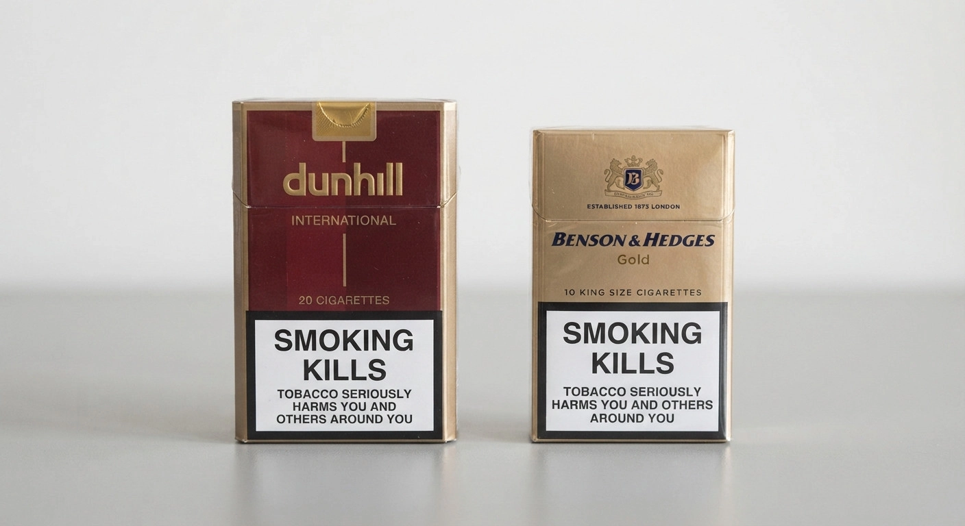
Hard Pack (Flip-Top)
Hard packs are built from rigid material that holds its shape under pressure. That structure keeps the cigarettes inside safer during travel. Most hard packs carry 20 cigarettes and stay popular simply because they hold up well over time.

Soft Pack (Soft Cup)
Soft packs bend and fold since they’re made from lighter paper. They’re cheaper to produce, though they don’t protect cigarettes quite as well as a hard pack does. You’ll usually find 20 cigarettes inside these too.
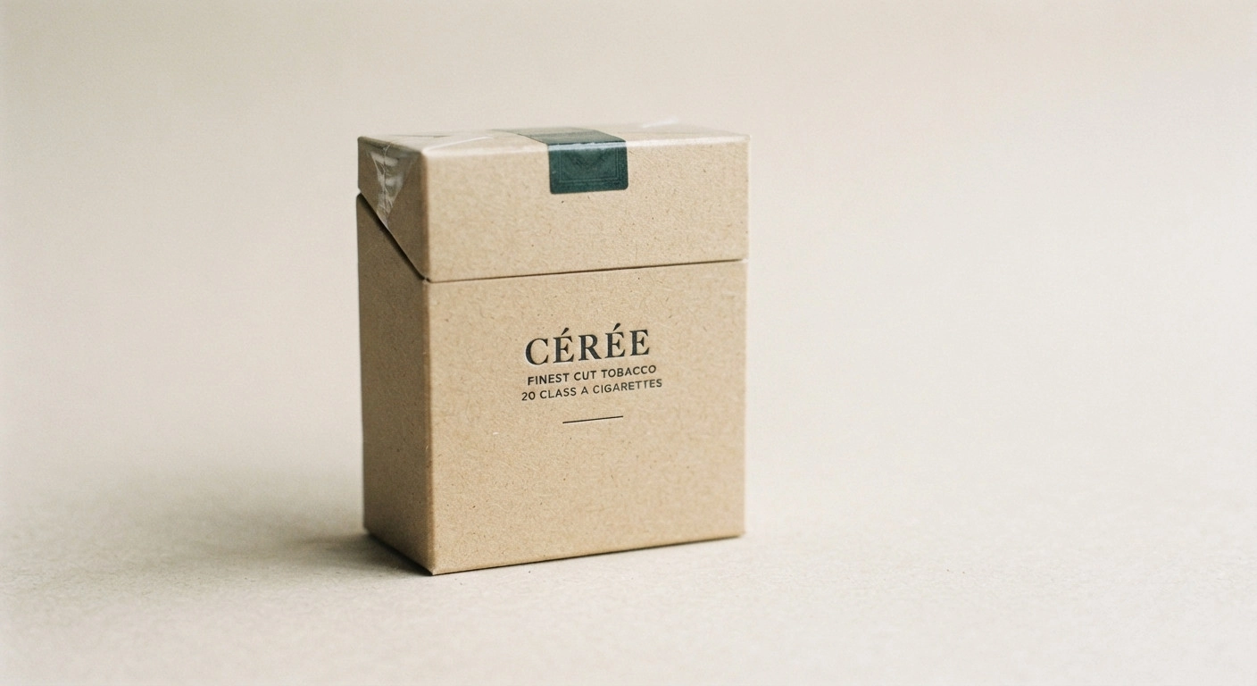
Slide-and-Shell Box
This one opens with a sliding inner tray, which gives it a smoother feel than a typical flip-top. Premium brands lean toward this style because it looks more refined on a shelf. It’s a small design choice that adds a sense of quality.

Tuck End Boxes
A tuck end box closes with a flap folded into the top and bottom, keeping everything sealed shut. It’s a straightforward design, which is probably why it’s so common across regular, everyday packs.

Slim Pack Boxes
These boxes are narrower to match thinner cigarettes inside. The slim shape slips into a pocket or bag without much fuss. Smokers who prefer a slimmer cigarette often gravitate toward this pack style as well.
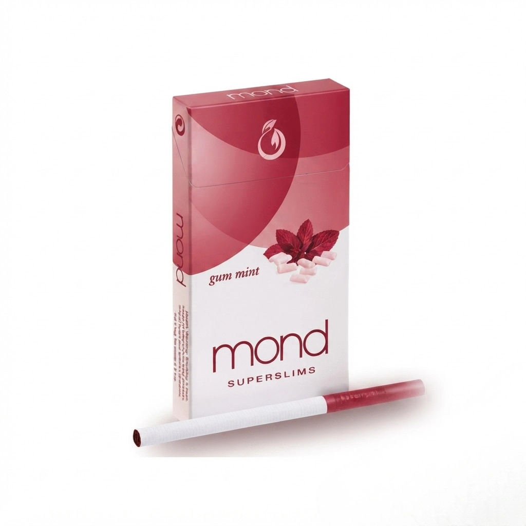
Standardized and Plain Packaging
A growing number of governments now require plain packaging with almost no branding allowed. Most of the pack’s surface goes toward health warnings instead of logos. Australia was among the first to push this rule through, and other countries have followed since.

Cigarette Pack Dimensions by Brand
Even with the same cigarette count, box dimensions can shift from one brand to the next.
Common Dimensions Across Popular Brands
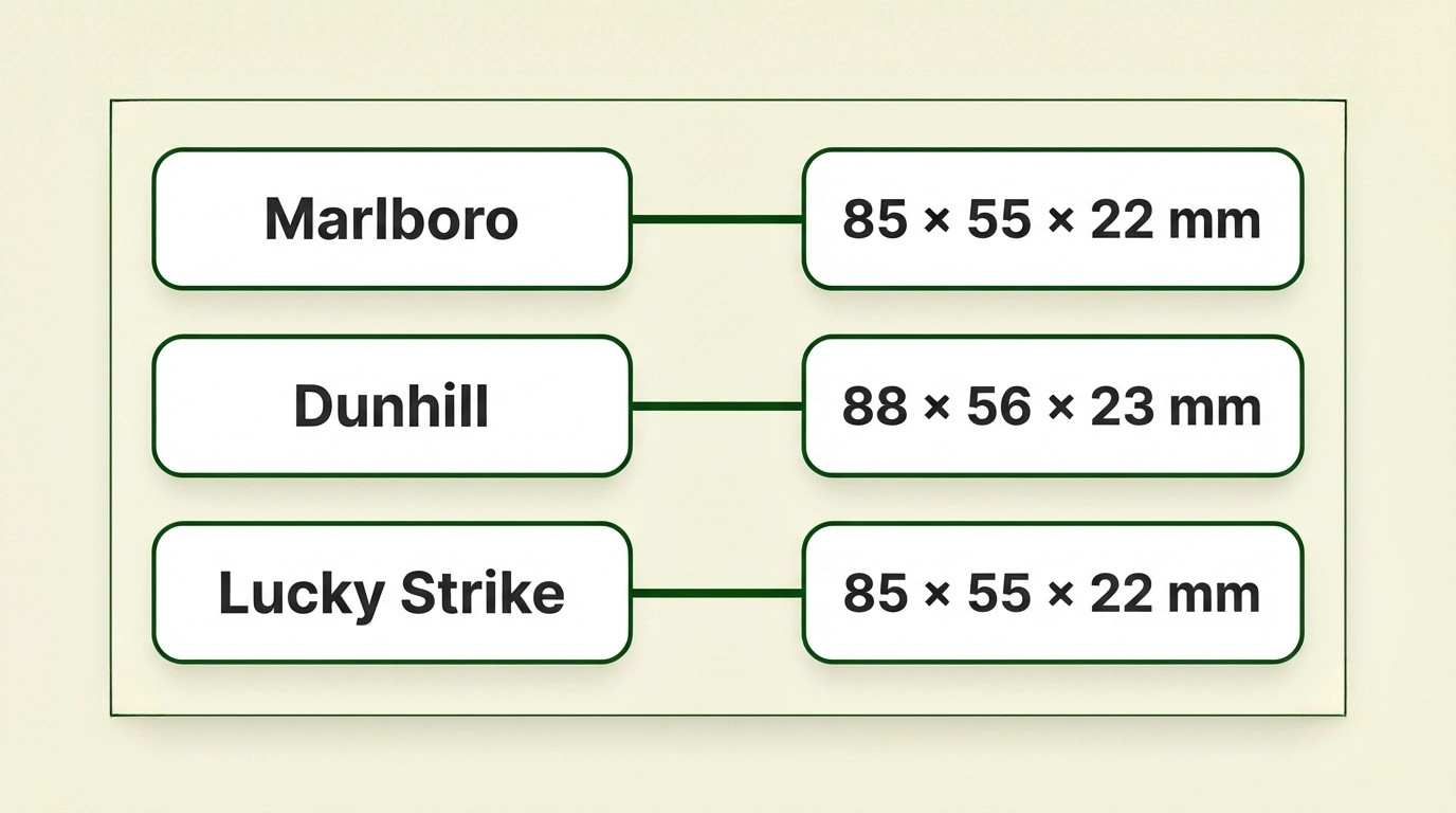
- Marlboro packs come in around 85mm x 55mm x 22mm.
- Dunhill sits close by at roughly 85mm x 55mm x 23mm.
- Lucky Strike measures about 85mm x 55mm x 22mm.
These small gaps in size usually come down to each brand’s own packaging style and who they’re trying to reach.
Cigarette Length and Size Guide
Length is another variable, and it changes depending on the brand and where the cigarette is sold.
Standard Size
A standard cigarette runs between 70mm and 85mm, or roughly 2.75 to 3.35 inches. It’s still the most widely sold length across the globe.
King Size
King size cigarettes stretch a bit further, from 84mm to 90mm, around 3.3 to 3.5 inches. A lot of major brands have shifted toward this as their default length.
Long Size
Long cigarettes go from 100mm up to 120mm, close to 3.9 to 4.7 inches. Smokers who want a slower, longer smoke tend to reach for this size.
Slim Size
Slim cigarettes match that same length range but come with a noticeably thinner diameter. That gives them a sleeker look overall. Plenty of brands offer a slim option just to cover more smoker preferences.
Cigarette Cartons and Bulk Packaging
A standard carton holds 10 packs. Multiply that by 20 cigarettes per pack, and you land on 200 cigarettes in one carton.
Broken down plainly:
- 1 carton equals 10 packs
- 1 standard pack equals 20 cigarettes
- 1 carton equals 200 cigarettes
People buy in bulk for different reasons. Some want fewer trips to the store. Others are simply chasing a better price per pack.
Mini Cartons for Light Buyers
Mini cartons scale that down to 5 packs instead of 10. They suit buyers who want a bit more than a single pack but don’t need a full carton. It’s a middle-ground option that a lot of casual buyers appreciate.
How Cigarette Box Dimensions Affect Branding
The size of a box says something about the brand holding it. A slim or king-size box gives off a different feel than a bulky hard pack does. Dimensions also affect how easily a pack fits into a pocket or bag, and that everyday convenience quietly shapes brand loyalty over time.
Regulation of Cigarette Pack Sizes
Governments regulate pack sizes for a mix of reasons, and pricing is only part of the story.
Regulating Pack Sizes to Control Pricing
Pack size and price are closely linked. Some companies used to shrink packs quietly as a way to soften the sting of a tax increase. Regulating pack size directly helps keep pricing honest for the buyer.
Regulating Pack Sizes to Reduce Smoking Rates
Part of the thinking behind these rules is that smaller or fewer pack options might reduce smoking overall. The evidence on that front is still thin. Whether this particular policy actually moves the needle remains up for debate.
Packaging Restrictions on Branding
Rules on pack size rarely travel alone. They usually come bundled with restrictions on labeling and design too. Since around 2011, many governments have tightened these packaging laws, limiting logos, colors, and graphics to cut down on marketing appeal.
Economic and Marketing Factors Behind Pack Sizes
Pack size isn’t just a practical choice. It’s a marketing one too.
Pricing Strategies
Companies shift pack size and pricing to reach different kinds of buyers. Budget-minded smokers want the cheaper option. Others are drawn to premium products that feel a step above the rest. Adjusting pack size lets a brand serve both crowds at once.
Branding and Packaging Design
How a pack looks says a lot about the brand behind it. In a crowded industry, standing out isn’t optional. Companies pour real money into bold packaging choices, partly for attention and partly to build loyalty that lasts.
Cultural and Regional Influences
Packaging style tends to follow local taste. Some markets go for bright, loud colors. Others prefer something quieter and more minimal. Either way, the goal is the same: help smokers spot a familiar product fast.
Common Materials Used in Cigarette Packaging
The material behind the pack affects cost, durability, and how fresh the product stays over time.
Cardboard and Kraft Paper
Cardboard and kraft paper show up in both standard and rigid boxes. They strike a reasonable balance between cost and strength. Kraft paper also gives off a more natural look, which some brands lean into for marketing purposes.
Foil and Mylar Lining
Foil and mylar lining sit inside the pack to block out moisture and air. That lining is what keeps cigarettes fresh for longer. Most standard and premium packs rely on one or the other.
How Many Packs Are in a Carton?
A standard carton holds 10 packs, and since each pack usually contains 20 cigarettes, that adds up to 200 cigarettes per carton. Mini cartons cut that down to 5 packs for buyers who want less. Larger bulk cartons exist too, mostly for wholesale buyers moving higher volumes.

Get Custom Cigarette Packaging Built Around Your Brand
From structural design and prototyping through to high-quality printing and large-scale production, we manufacture custom cigarette packaging built around your product dimensions, branding, and business goals. Contact Hot Custom Boxes today for a free quote, and let’s create custom cigarette packaging that protects your products, strengthens your brand identity, and leaves a lasting impression on your customers.
Frequently Asked Questions
A standard box, around 3.35 x 2.20 x 0.87 inches, can technically fit up to 30 cigarettes. Legal limits usually cap that at 20 in the US and 25 in Canada and Australia.
20 cigarettes per pack. A full Marlboro carton holds 10 of those packs, so 200 cigarettes total.
Also 20 cigarettes per pack. That’s the standard count across most US brands.
20 in the US. Canada and Australia often bump that up to 25.
10 packs, which comes to 200 cigarettes altogether.
A sleeve is just another word for a carton, so 10 packs and 200 cigarettes.
Yes, packs of 10 turn up in countries like India and parts of Africa. They’re banned in the US, EU, UK, and Australia though.
Yes, mostly in parts of Canada and Australia. You won’t find them in the US or the EU, where 20 stays both the legal minimum and the market standard.
Related Products
$0.50 Original price was: $0.50.$0.10Current price is: $0.10.
In Stock
$0.50 Original price was: $0.50.$0.10Current price is: $0.10.
In Stock
$0.50 Original price was: $0.50.$0.10Current price is: $0.10.
In Stock
$0.50 Original price was: $0.50.$0.10Current price is: $0.10.
In Stock