


How To Choose Right Colors For Your Packaging Design
Home » How To Choose Right Colors For Your Packaging Design
Table of Contents
Get A Free Quote
Colours play a significant role while designing packaging for your product. There are a variety of colours from which you can choose a colour or mix colours for your product packaging. But you cannot simply choose a random colour. There is a colour psychology behind choosing a specific colour contrast for your brand’s packaging, which you need to understand.
Choosing the right color scheme can make your product stand out on crowded shelves. It enhances your brand image and improves the consumer experience. It also has a significant impact on the purchasing decisions of the customers. Hot Custom Boxes can make it easier for you to design a custom packaging that people will admire and love!
This article aims to explore how different colors in product packaging design affect consumer behavior and brand perception. By understanding the psychological and marketing impact of color choices, brands can make informed decisions in their custom packaging to improve product appeal and success.
Colour Theory: How Colours Influence Decisions
Colour psychology in marketing is based on choosing the fine artwork and the right combinations of colours. That can evoke a feeling of a certain business, brand and product. Do you know? Why is candy packaged in a bright colour? Because consumers often perceive these bold colours as fun and exciting.
You must have learned about the colour wheel while you were in school. At that time, you might have learned about primary colours and how blue and red colours can mix together to make a purple colour. Different colours evoke specific feelings and emotions. Let’s take a quick look at the colours from a marketing point of view:
| Colours | Description |
|---|---|
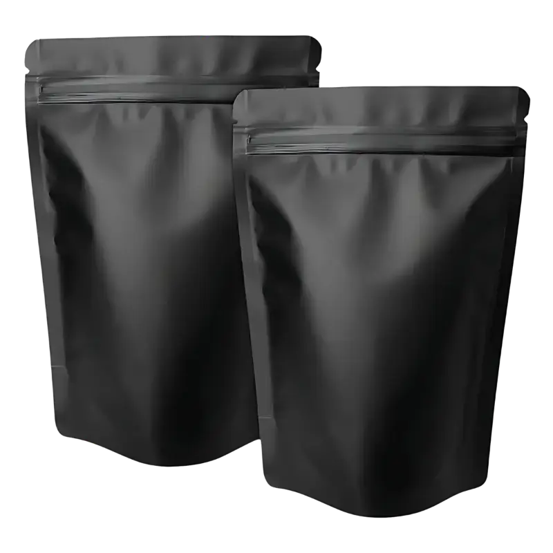
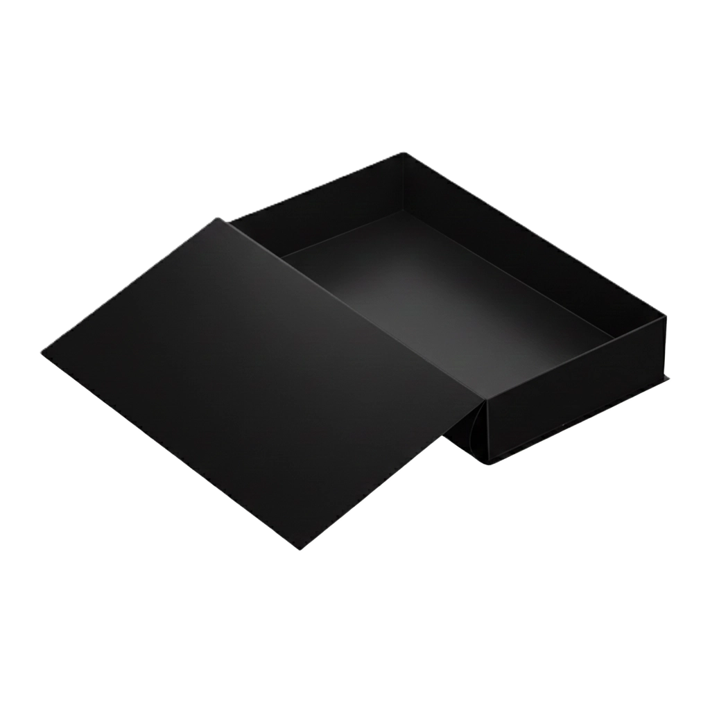
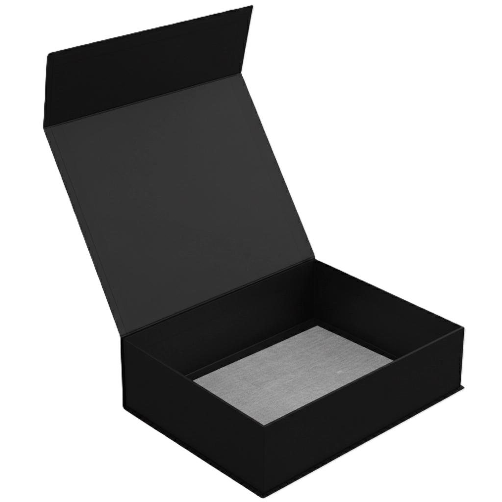
| Black | Black colour is a dark and heavy colour that often provides a sense of luxury. Brands that are looking to package their premium products often rely on black colour to give a sense of sophistication and luxury in a better way. |
| Purple | Purple colour can be used for food items, and darker purple indicates luxury and royalty. Light purple colours like lavender can be used for packaging baby products. |
| Blue | It is a strong and calming color. Businesses who are looking for colour attributes that add seriousness and reliability to their product packaging can go for the deep blue colour. It also provides a sense of professionalism and dependability to the shopper. |
| Red | Red colour is often used in the fast food packaging industry to create a sense of appetite and full of energy. You can use this colour to package food items in it as it conveys a sense of luxury and expense. It is a color that promotes intensity and excitement both at the same time. |
| Pink | Pink is a girlish colour associated with femininity, youth and positivity. Cooler shades of pink can be used to convey a mood of calming and soothing emotion to the female buyers while designing packaging boxes. |
| Yellow | It is a colour that the human mind processes before any other colour. Yellow is a warm, bright colour which indicates the mood of happiness. Businesses that incorporate yellow colours in their packaging designs often represent very welcoming and friendly brands. |
| Orange | Orange provides a sense of freshness in a brand that makes a product feel bright and new. Some tones of orange can be seen as expensive when they are placed on the display shelves with other products. |
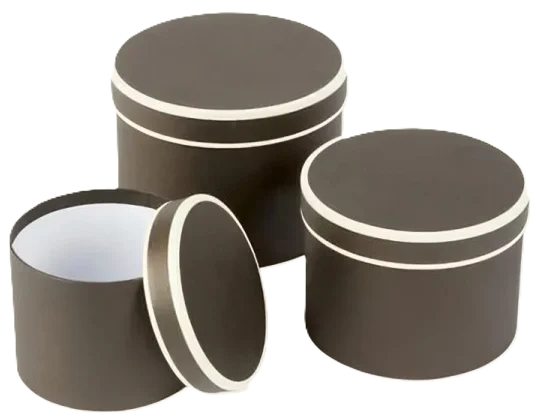
| Green | Green colour is always related to nature. It provides a feel of freshness and vitality of the product that is packed in green colour packaging. Dark shades of green indicate luxury and premium quality products. |
| White | White colour generally represents a feeling of purity, simplicity and cleanliness. Custom packaging designs heavily rely on the power of this colour as it creates a balance between power and simplicity. You can use white and black colours to write text on packaging boxes, since white colour can be used for deeper shades. |
Note: You can evoke the desired emotional response from your target audience, by using these colours strategically while designing your custom packaging with logo and other brand elements.
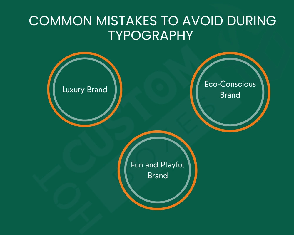
How Colour Psychology Can Affect A Brand’s Personality?
Choosing the right colours and materials for your brand is a very crucial step while designing your best product packaging for retail. It is a visual representation of your brand’s personality. You can print your brand’s logo with different colour combinations. Here are some of the ways how colour psychology affects a brand’s personality:
- Luxury Brand: Brands that use black, gold or silver colours for designing their packaging adds a sense of sophistication and exclusivity.
- Eco-Conscious Brand: Eco-conscious brands use natural, earthy or unique green colours to represent their love towards nature.
- Fun and Playful Brand: Brands that want to add a touch of joy and youthfulness to their product packaging use bright colours like orange or pink.
To communicate your brand values to your consumers, you need to choose the right color scheme that will effectively convey your brand’s message. You can increase brand recognition and loyalty by using a consistent colour palette throughout the product packaging designs.
Color Harmonies And Combinations
There are different types of color combinations that will make your packaging design way more elegant and attract customers to itself. Going back to the color wheel, it is a tool that is used to find harmonious colour combinations that are known as colour schemes. Let’s explore the types of colour harmonies:
Complementary
Analogous
Triadic
Monochromatic
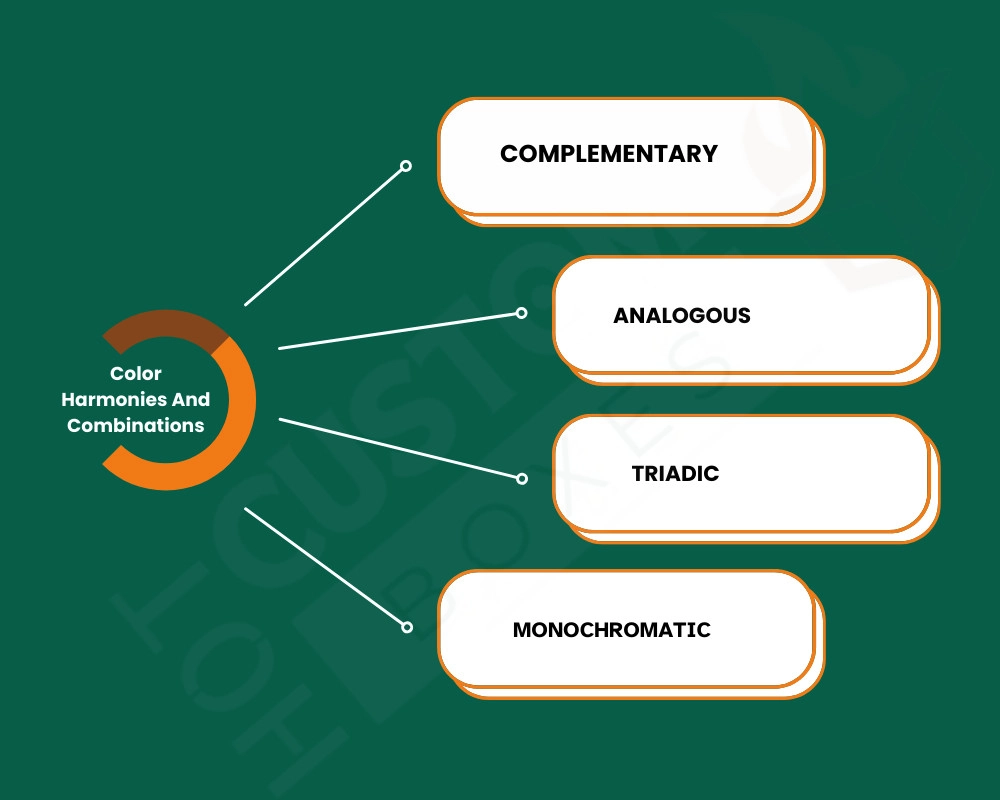
Complementary
It uses two or three opposite colours on the same arc of the colour wheel, like blue and orange, to create a vibrant colour that attracts consumers.
Analogous
Choose colours next to each other on the colour wheel, like blue, green or teal for a harmonious and pleasing effect.
Triadic
A triangle is placed over a colour wheel, and you will get two complementary colours and one balancing colour, which works well together.
Monochromatic
It is a variation on a single hue with different shades and tints. It can be used for a clean and sophisticated appearance.
Key Factors For Using Colour Scheme On Custom Packaging Design
Now you have the basic understanding of the colour scheme and how to use it. Here are some of the key elements that you should keep in your mind while designing your next custom packaging.
- Know Your Brand Identity
- Understand Your Targeted Audience
- Identify Customer Feeling For Your Product
- Play With Colour Shades
- Don’t Let Your Colours Fade
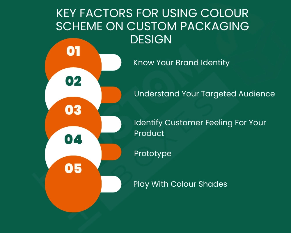
Know Your Brand Identity
While designing your custom packaging you need to know around what your brand’s story revolves. If it revolves around luxury and sophistication, then you should choose sleek black and gold colour schemes, not the turquoise one. Every product and its packaging should reflect your brand identity.
Understand Your Targeted Audience
Understanding of your targeted audience is very important when you are designing your product packaging. Because every person interprets colours’ meanings slightly differently, you need to research the colours first. For example, colors associated with death and mourning can vary from culture to culture, and so can ideas of which colors are the most luxurious. You need to focus on these points to know your audience:
- Age
- Gender
- Cultural backgrounds
- Market Trends
Identify Customer Feeling For Your Product
How do you want your customers to feel when they are purchasing your products? Like they should feel happy and positive when they purchase your products, or relieved and confident, it all depends upon your packaging design. It is important to identify how your customers react and feel about your product’s packaging design when they first look at it on the retail shelves.
Play With Colour Shades
You can play with a single colour shade, like a monochrome colour scheme, to make your packaging stand out in competition. You have to explore different colour combinations and shades to pick the right one for your product packaging that aligns with your brand image.
Don’t Let Your Colours Fade
A lot of the big and older brands set their packaging designs only once, and then they didn’t change them over time. You should change your brand colour schemes and make them look fresh each time the shopper purchases it. You can also add a seasonal touch to your packaging to keep up with the trends.
Role Of Colour Scheme In Different Industries
Colours play a vital role in how shoppers perceive products across different industries. Whether you want to make your food look more appetising or want to add a touch of elegance to your cosmetics, the right color attributes in product packaging design can significantly impact sales and brand image. Here are some of the great industries that use colour attributes for their advantage:
| Industries | Advantages Of Colour Schemes |
|---|---|
| Food and beverages | Red and yellow colours are used to increase appetite and joy. Whereas some of the brands also use green colour to show freshness and sustainability through their packaging. |
| Makeup and cosmetics | Pastel and neutral tones like beige, pink and peach are used to evoke a sense of elegance and simplicity. Other than that, bold colours like black and purple are used to convey a feel of modern and edgy look. |
| Technology and Electronics accessories | For tech products, black, silver and white colours are used to add a sense of innovation and sophistication. |
| Eco-friendly products | Earthy tones like brown, green and muted colours are used to create a sense of an eco-friendly brand. Younger people will be attracted to this kind of packaging as now youth are becoming aware of global warming issues and turning to eco-friendly packaging. |
Case Studies Of Successful Colour Palette Uses
Color is a powerful tool that many brands use to stand out and resonate with their audience. Let’s look at some iconic brands that have successfully used unique color palettes and typography in their product packaging design. Examples of some of the popular iconic brands:
- Coca-Cola: They use red colour to evoke a sense of energy and excitement that helps them stand out in the beverage industry with a consistent look.
- Apple: Apple uses sleek black, white and silver colour designs to convey a message of innovation and simplicity.
Tiffany & Co.: The Tiffany blue colour box is a signature look that conveys a brand’s message of luxury and exclusivity.
Start Your Designing Journey With Hot Custom Boxes!
Set your brand apart through colourful packaging designs. Contact us now for free design support through call (332) 263-6086 or email [email protected] and start your packaging journey with Hot Custom Boxes!