



















Table of Contents
Related Products
$0.50 Original price was: $0.50.$0.10Current price is: $0.10.
In Stock

$0.50 Original price was: $0.50.$0.10Current price is: $0.10.
In Stock
$0.50 Original price was: $0.50.$0.10Current price is: $0.10.
In Stock
$0.50 Original price was: $0.50.$0.10Current price is: $0.10.
In Stock
Get A Free Quote
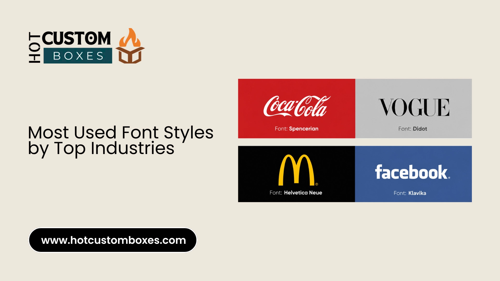
You know that split second before you even read a logo, when you already have a feeling about the brand? That’s the font talking. Not the words. The shapes of the letters do most of the work before your brain even catches up.
I used to think this was overthinking design, honestly. Then I started to notice that how every bank looks the same, every tech app looks the same, every law firm still uses that same stiff same old-schools. It’s not an accident. Someone sat in a meeting and picked that font on purpose.
So here’s a rundown of 25 fonts that show up constantly across major industries, sorted by sector. By the end you’ll probably understand why a scrappy startup reaches for Inter while a 90-year-old law firm won’t touch anything but Times New Roman.
Why Font Choice Actually Matters
A font is basically a voice with no sound. Round, soft letters come off friendly. Tall, sharp ones feel serious, sometimes even cold. Clean straight lines read modern. Those little “feet” on certain letters (serifs, if you want the technical term) read as classic, older, more established.
Brands lean into whichever voice fits them. A toy company using the same font as a law office would feel wrong immediately, even if you couldn’t say exactly why. Your gut just knows.
That’s the whole reason industries cluster around similar styles. Let’s go through them.
Tech and Software Companies
Tech wants to look clean and modern, nothing that slows you down or feels heavy.
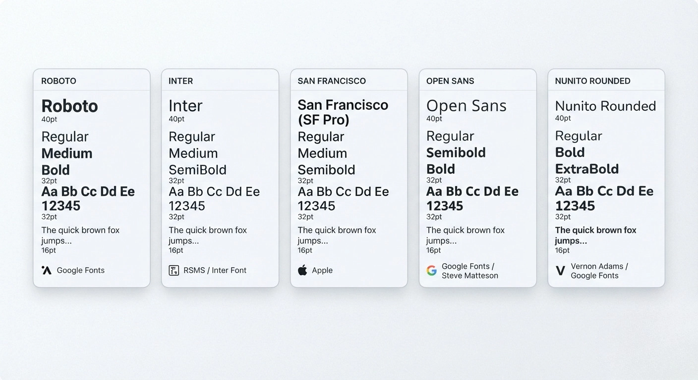
- Roboto: Google’s font, and it’s basically everywhere now, Android, countless apps, you name it. Stays legible even on a cracked phone screen at 2am, which is really the whole point.
- Inter: Built specifically for screens. Every letter holds up at tiny sizes. Figma runs on it, GitHub too, half the SaaS world at this point.
- San Francisco (SF Pro): Apple’s own typeface. iPhones, Macs, ads, all of it. Smooth and minimal, and somehow you can spot it instantly even without the logo.
- Open Sans: Kind of the default safe choice. Free, readable, holds up at any size. A lot of web apps just default to it and move on.
- Nunito: Rounded, soft, a little warm. Productivity tools and wellness apps like it because it feels human instead of corporate.
Finance and Banking
Money’s a serious business, and fonts here need to say “trust me” without trying too hard. Banks basically never gamble on design.
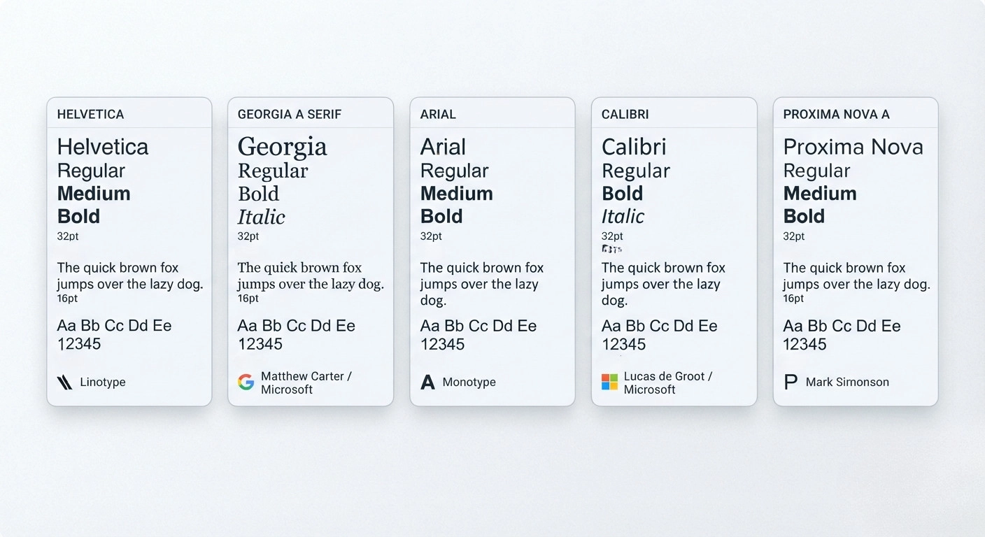
- Helvetica: The old standby. Neutral, stable, zero drama. Big banks use it because boring, in this case, equals trustworthy.
- Georgia: A serif that works fine in print and on screens. Financial reports lean on it for long documents since it’s easy on tired eyes.
- Arial: Probably the single most common font anywhere. Banks, insurance forms, government paperwork, all defaulting to it without much thought.
- Calibri: Microsoft’s old default. Clean, forgettable in a good way. You’ve seen it in more finance PDFs than you’d probably guess.
- Proxima Nova: A slightly more polished version of what Arial does. Fintech startups like it because it still feels fresh, just not too casual.
Healthcare and Medical
Calm and clear, that’s the whole goal. No sharp edges, nothing confusing, especially for older patients reading small text.
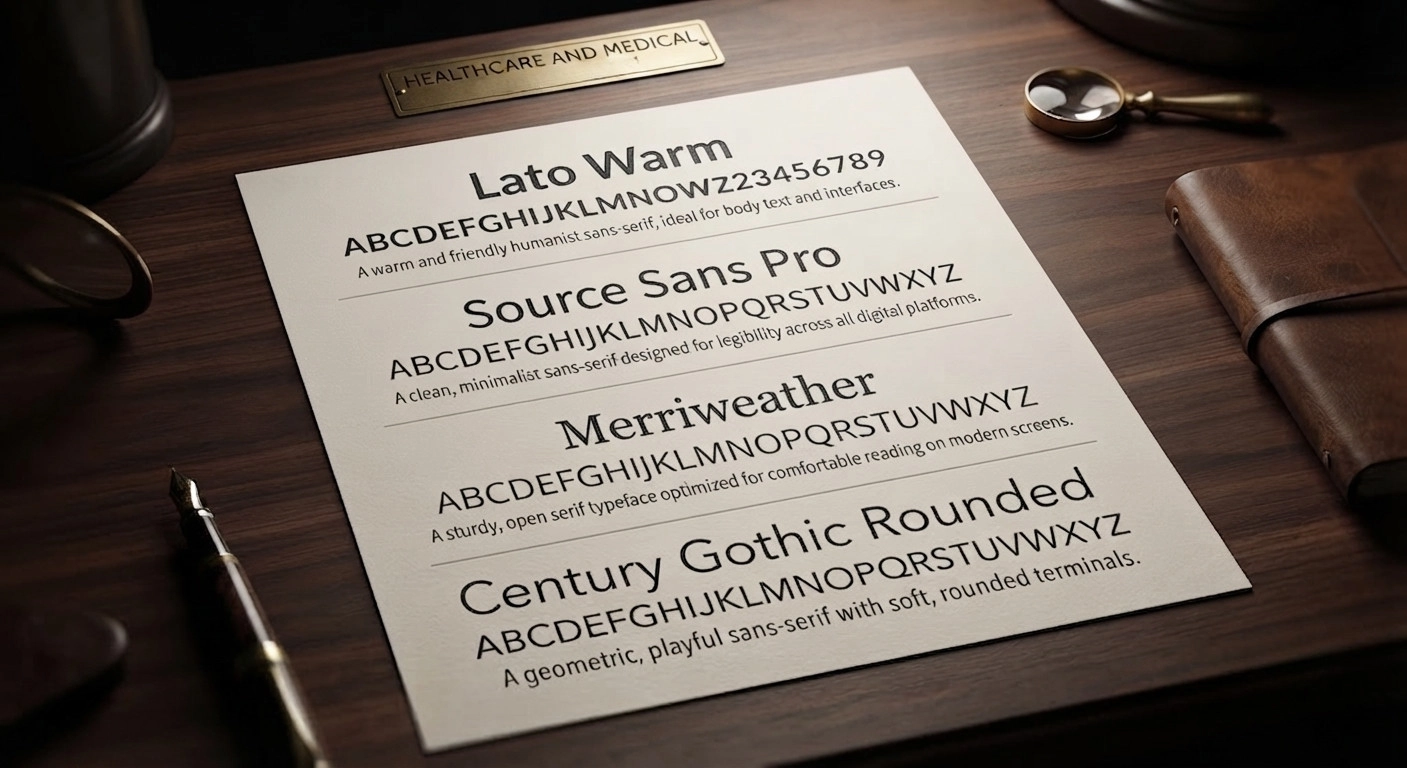
- Lato: Warm and easy to read. Hospitals like it because it’s friendly without turning childish.
- Source Sans Pro: Adobe’s clean sans-serif, common on medical sites and patient portals. Stays out of the way of the actual content.
- Merriweather: Built for comfortable long reads. Health blogs and medical journals often use it for body copy.
- Century Gothic: Rounded and geometric, a bit airy. Shows up in healthcare headlines when a brand wants to feel lighter.
Fashion and Luxury Brands
This is where things get dramatic on purpose. Luxury brands sell a feeling, and the letters need to carry some of that weight.
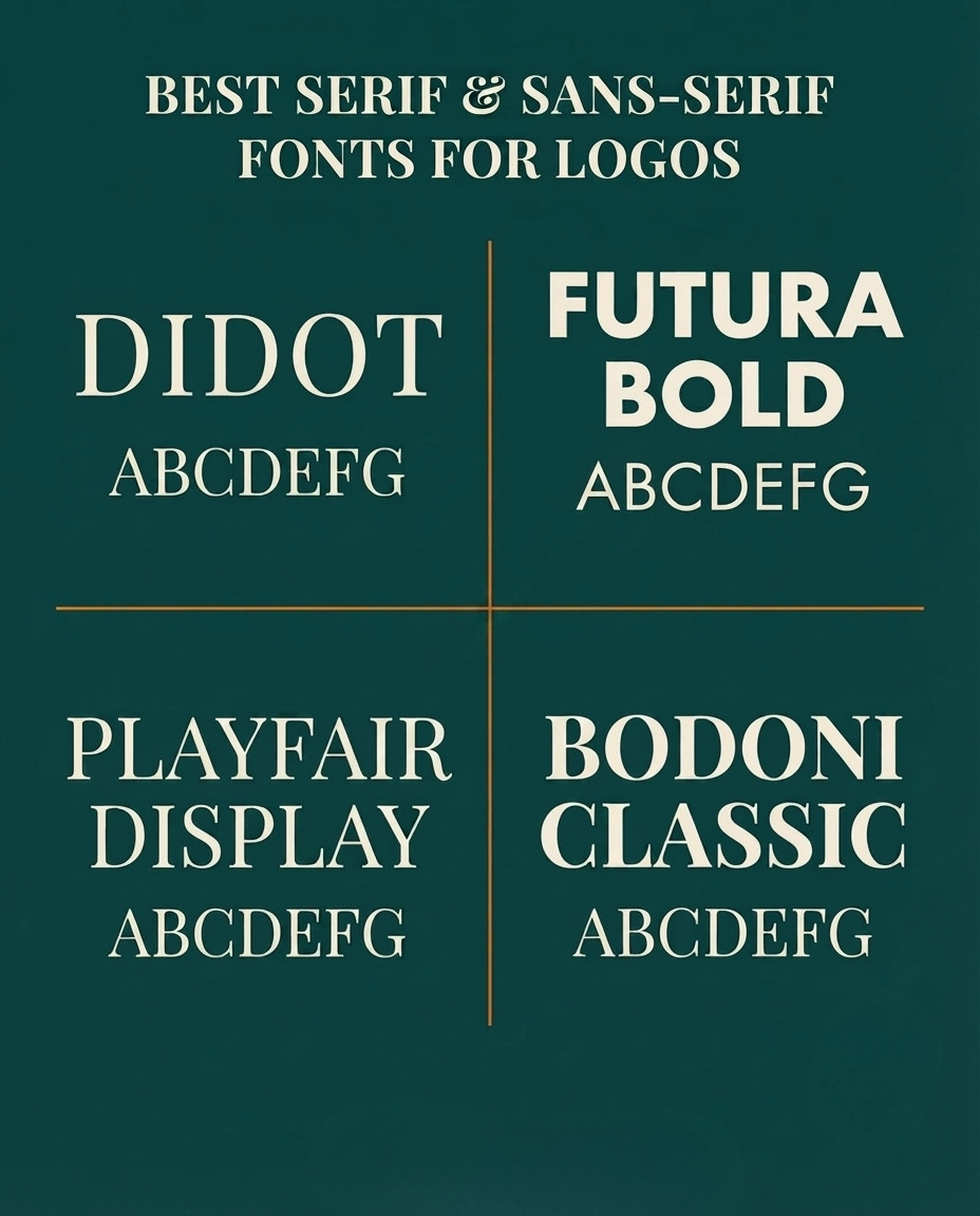
- Didot: Thin, tall, theatrical. Vogue’s masthead uses a version of this. Instant high-fashion signal.
- Futura Bold: Geometric, confident. Simple shapes that somehow punch above their weight.
- Playfair Display: Elegant serif with big contrast between thick and thin strokes. Beauty brands and boutique labels love it.
- Bodoni: Classic, a little over the top in the best way. Common on perfume boxes and luxury packaging.
Food and Beverage
It is really something joyful and inviting and warm. Food businesses require fonts that look handwritten.
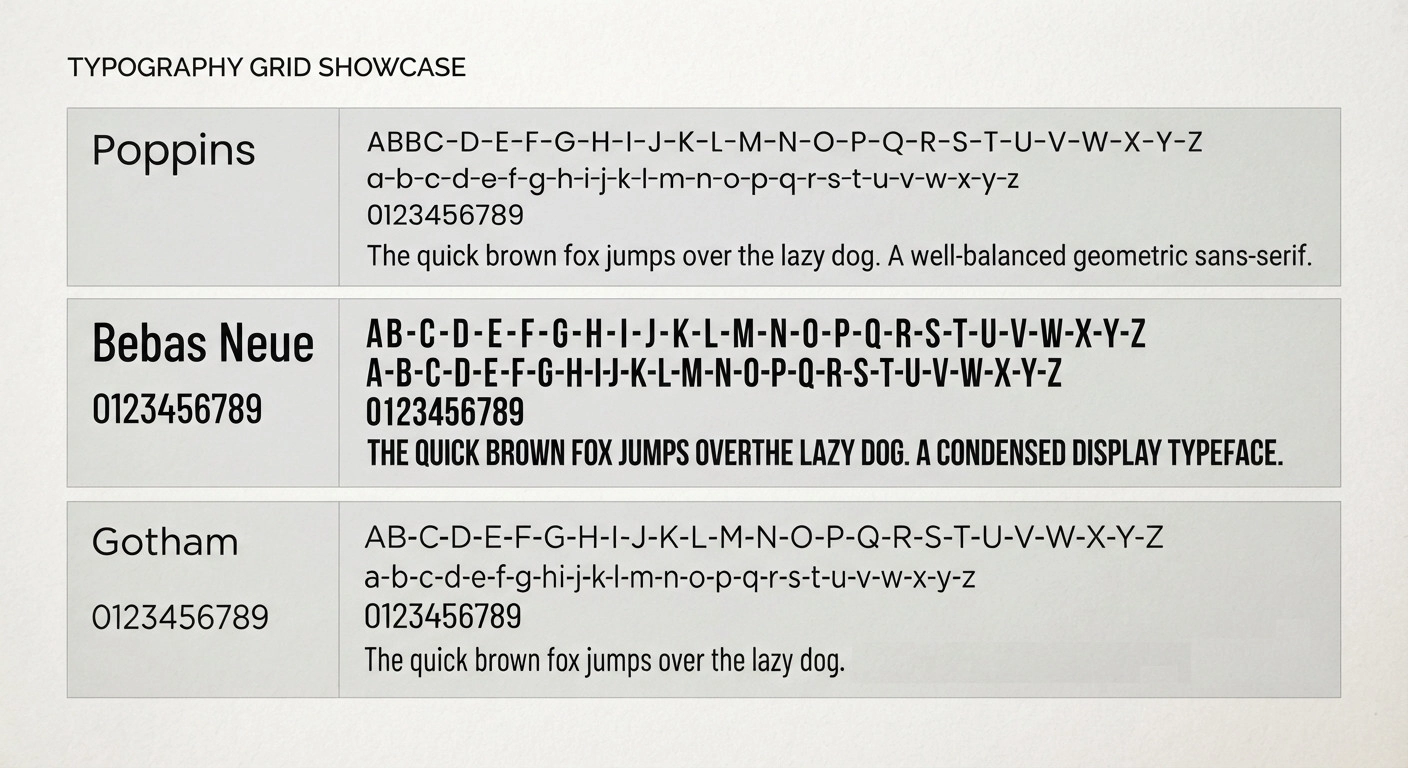
- Poppins: Rounded and geometric but still warm. Cafes and delivery apps use it constantly.
- Bebas Neue: Bold, tall, condensed. Great for a menu header or a loud promo banner. Shows up on packaging everywhere.
- Gotham: Strong and geometric. A lot of restaurant chains use it, and fun fact, Obama’s 2008 campaign is partly why this font blew up.
Education and Nonprofits
Approachable and easy to read matters most here. Trust, sure, but warmth too.
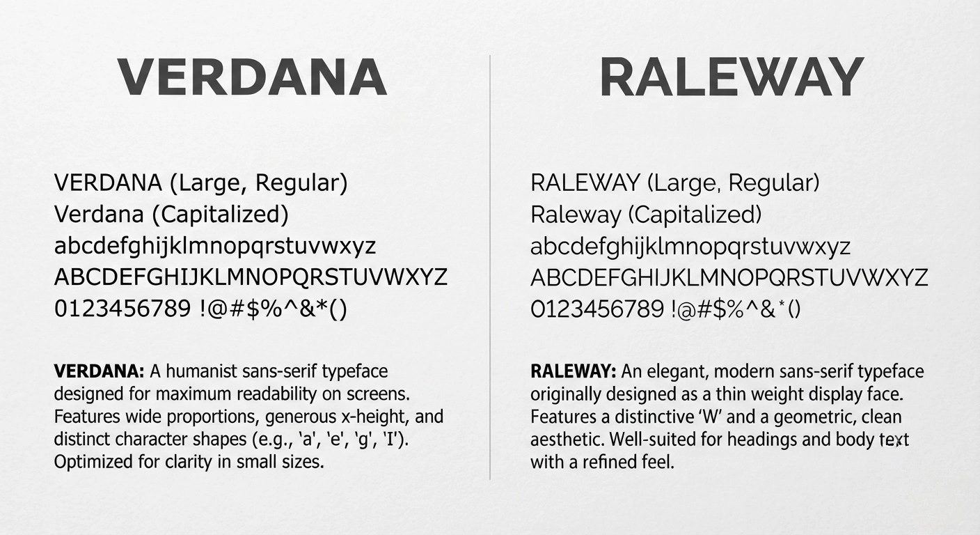
- Verdana: Made for screen readability from the start. Schools like it because it’s gentle on young eyes.
- Raleway: Elegant but not stuffy. Nonprofits use it for a clean look that doesn’t feel too corporate.
Legal and Government
Tradition beats trend every time in this world.
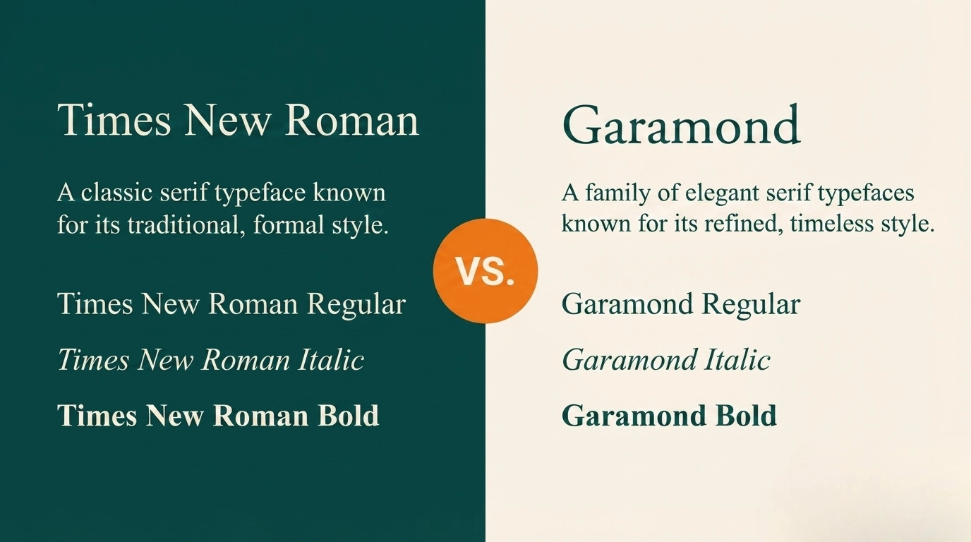
- Times New Roman: The most traditional font around. Courts and contracts still lean on it heavily.
- Garamond: Classic and dignified. Common in legal filings and academic papers alike.
Common Mistakes Brands Make With Fonts
Using too many fonts. Five typefaces on one page just looks messy, like nobody was in charge of the decision. Two or three, max, is the usual rule.
Ignoring readability. A cool-looking font still fails if people can’t read it fast, especially on a phone screen while walking or half paying attention.
Copying competitors exactly. Fine to take inspiration, but matching your biggest rival’s font makes you forgettable. You end up looking like a knockoff instead of a competitor.
Forgetting accessibility. Thin, low-contrast fonts are genuinely hard to read for people with visual impairments, and that’s not a small slice of your audience.
Changing fonts constantly. Switch every year and nobody ever connects the look with your name. Consistency is what makes a brand recognizable at a glance.
How to Pick the Right Font for Your Own Brand
Start with one word. What’s the single feeling you want people to walk away with? Trustworthy, playful, elegant, bold, whatever it is, pick that first, before you look at a single typeface.
Then browse with that word in mind. Google Fonts works fine for this, and it’s free. Filter by category and test a handful side by side rather than falling for the first one that catches your eye.
Test everything in context, not on its own. Drop it into a mock logo or a sample page. Fonts read totally differently depending on size and spacing, so a font that looks great as a giant headline might look cramped in a paragraph.
Ask other people what they feel when they see it. Their gut reaction usually lines up with how real customers will react, and it’s a lot cheaper than guessing.
And don’t overthink it. You don’t need some rare, pricey typeface to look legit. Plenty of huge, hugely successful brands still just use Helvetica or Arial and call it a day.
What This Tells Us
Tech goes sans-serif and modern. Finance stays neutral and steady. Fashion gets dramatic. Legal sticks with tradition. None of it’s random. It’s a strategy.
If you’re building a brand, figure out the feeling first. Then find a font that matches it, not the other way around.
A Quick Cheat Sheet
- Modern and techy? Inter, Roboto, or SF Pro.
- Trustworthy and financial? Helvetica, Georgia, or Arial.
- Calm and medical? Lato or Source Sans Pro.
- Luxurious? Didot, Bodoni, or Playfair Display.
- Warm and food-friendly? Poppins or Gotham.
- Traditional and legal? Times New Roman or Garamond.
Simple rule, big impact.
The Power of Choosing the Right Font
Fonts are quiet, but they do a lot of heavy lifting. They shape first impressions before anyone reads a single word.
Next time you pass a logo or pick up a menu, look closer. Notice the font. Ask why someone picked it. You’ll start spotting this stuff everywhere.
Good design usually isn’t loud. It’s intentional. Font choice might be one of the most deliberate decisions a brand ever makes.
Frequently Asked Questions
Not at all, It depends on the industry and the mood you’re after. Helvetica’s great for a bank, flat for a toy brand.
Yes. Most of these are free or cheap. Roboto, Lato, Open Sans, nothing stopping you.
Serif feels classic and formal. Sans-serif feels modern and clean. Match your brand’s personality, not a trend.
Two, usually. One for headlines, one for body text. A third only if it earns its spot.
Related Products
$0.50 Original price was: $0.50.$0.10Current price is: $0.10.
In Stock
$0.50 Original price was: $0.50.$0.10Current price is: $0.10.
In Stock
$0.50 Original price was: $0.50.$0.10Current price is: $0.10.
In Stock
$0.50 Original price was: $0.50.$0.10Current price is: $0.10.
In Stock