

















Table of Contents
Get A Free Quote
Color can look perfect on a designer’s screen but appear different when printed on cardboard, kraft paper or corrugated stock. Screens produce color with light. Printers reproduce it with ink. The material, coating, printing process and viewing conditions can change the final appearance further.
The Pantone Color Matching System gives designers, brands and printers a shared reference for discussing color. Instead of asking for a general shade such as deep red or navy blue, a buyer can provide a specific Pantone reference. This makes the target easier to identify, approve and reproduce.
However, a Pantone number alone does not guarantee that every printed piece will look identical. Accurate production also requires the correct swatch book, substrate, ink system, proof and quality controls. This guide explains how the Pantone system works and how to use it for branding, commercial printing and custom packaging.
What Is the Pantone Color Matching System?
The Pantone Color Matching System, often called PMS, is a standardized color identification and communication system. It assigns references to colors so that different people can work toward the same visual target. Designers use these references in artwork. Printers use them when preparing inks, proofs and production specifications.
This standard is more precise than a descriptive color name. Two people may picture different shades when they hear “royal blue.” A complete Pantone reference points them to a printed standard that they can examine and compare.
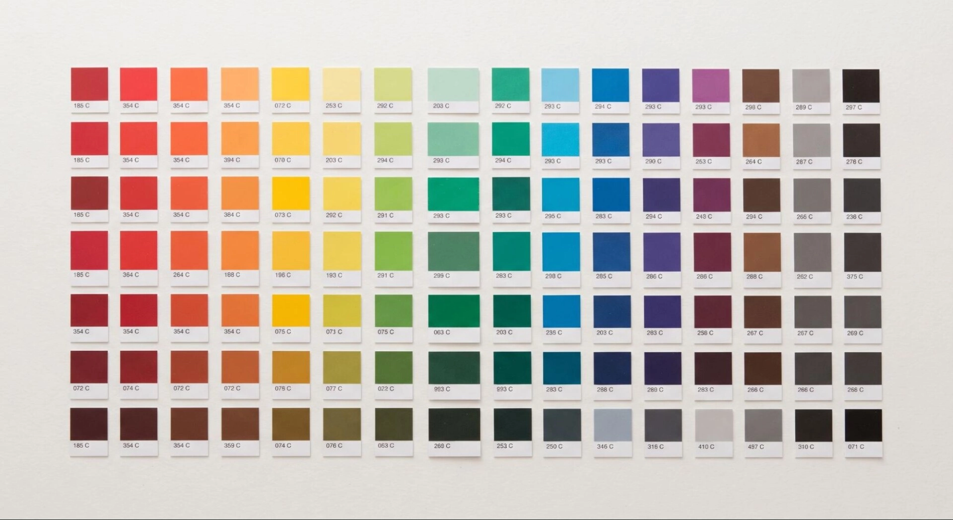
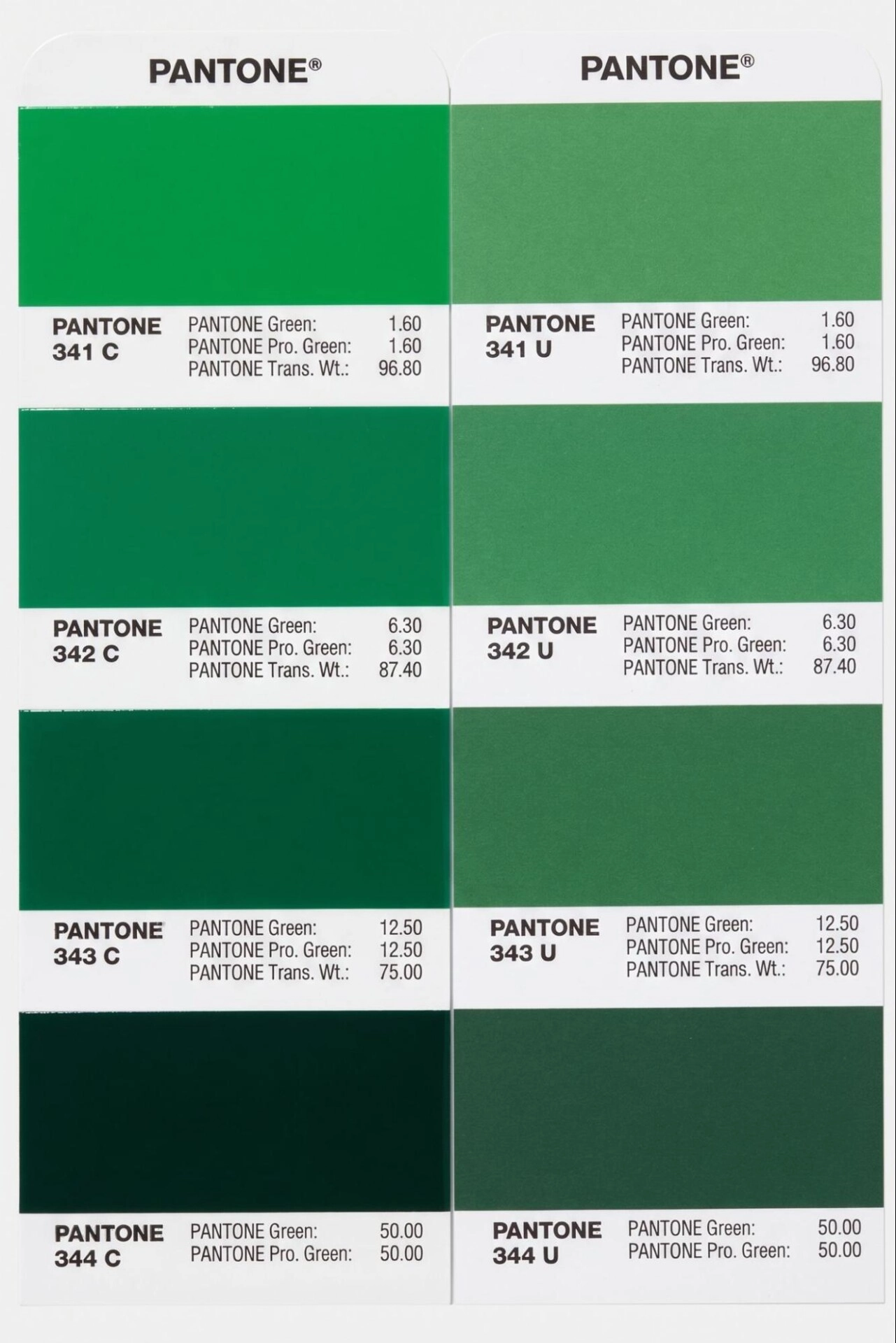
Pantone colors are commonly presented through physical guides containing printed swatches. A swatch shows how a specified color is intended to appear under defined conditions on a particular type of stock. The relevant guide and suffix must be included because a color printed on coated paper can appear different on uncoated paper.
The Pantone Matching System is widely used in graphic design, branding, print production and packaging design. Other Pantone systems also serve areas such as fashion, textiles and product design. These systems should not be treated as interchangeable because their materials and production requirements differ.
Why Was the Pantone Matching System Developed?
Before a shared color standard, color communication relied heavily on names, samples and individual supplier formulas. A brand could request the same red from two printers and receive visibly different results. Pantone developed a structured color language that made color identification easier across design and print workflows.
The system helps connect several stages of production. A brand selects a color. A designer records the correct reference in the artwork. The prepress team checks the file. The printer then uses the specification to produce and evaluate the printed color.
Pantone LLC manages Pantone color systems and related products. The Pantone Color Institute has a different role. It studies color trends and provides color-related consulting and forecasting. The Institute is well known for selecting the Pantone Color of the Year, but that trend program is not the same thing as the technical operation of PMS in print production.
How Does the Pantone Color Matching System Work?
The system works through a combination of standardized references, physical swatches and controlled production. A typical workflow follows several connected steps.
A Color Is Selected from a Relevant Guide
The designer or brand owner reviews a physical Pantone color guide intended for the planned material. The choice should be made under suitable lighting because warm, cool or weak light can affect color perception.
The Complete Reference Is Recorded
The artwork and production notes include the Pantone number, library and suffix. This prevents a printer from having to guess which version the customer intended.
The Printing Method Is Confirmed
A printer may produce the color as a dedicated spot color or simulate it through CMYK, digital inks or an expanded color gamut. These methods do not always give the same result. The quotation and proof should state which method will be used.
Ink and Press Conditions Are Controlled
For spot color printing, an ink is prepared or selected to match the specified target. The press operator must also manage ink film, density, substrate and other production settings. In flexographic work, factors such as the anilox roll and plate can influence color. In offset printing, paper and ink density remain important.
The Printed Result Is Evaluated
The result is compared with the approved reference or proof under consistent lighting. For color-critical work, a spectrophotometer can measure the printed sample and help determine how closely it falls within an agreed tolerance.
This process explains how Pantone colors are matched. PMS supplies the common target. Color management and production controls determine how closely the job reaches that target.
How to Read Pantone Color Codes
A Pantone reference normally contains a name or number followed by a suffix. For example, a specification may end in C or U.
- C means coated. This reference shows the color as printed on coated stock. A smoother coated surface usually holds ink closer to the surface and can produce a cleaner or more saturated appearance.
- U means uncoated. This reference shows the color on uncoated stock. More absorbent fibers can make the same ink appear softer, darker or less saturated.
A color with the same base number can look different in its coated and uncoated versions. Therefore, a designer should not provide only the number. The suffix is part of the color specification.
Some Pantone libraries cover metallic, pastel, neon or other specialty colors. Those references may need special inks, printing conditions or finishing decisions. Confirm their availability with the printer before finalizing the design.
Pantone numbers should not be interpreted like CMYK percentages or HEX values. The digits identify a standard within a library. They do not tell a user how much cyan, magenta, yellow and black to enter into artwork.
Pantone Formula Guide, Solid Coated, Solid Uncoated and Color Bridge
Choosing the correct reference tool is an important part of Pantone color selection.
Pantone Formula Guide
The Pantone Formula Guide is used to select and specify solid Pantone colors for graphic and printing applications. It normally presents solid colors in coated and uncoated formats. Printers and designers can use the guide as a physical reference when discussing a spot color.
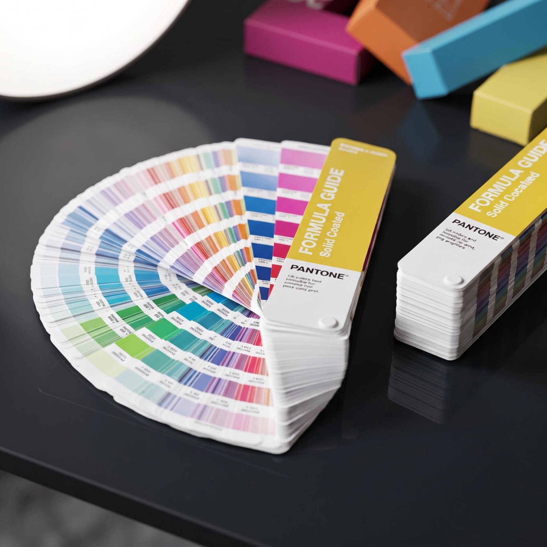
Pantone Solid Coated
The Pantone Solid Coated library represents solid colors on coated paper. It is often relevant to coated folding cartons, labels, cards and papers with a smooth print surface.
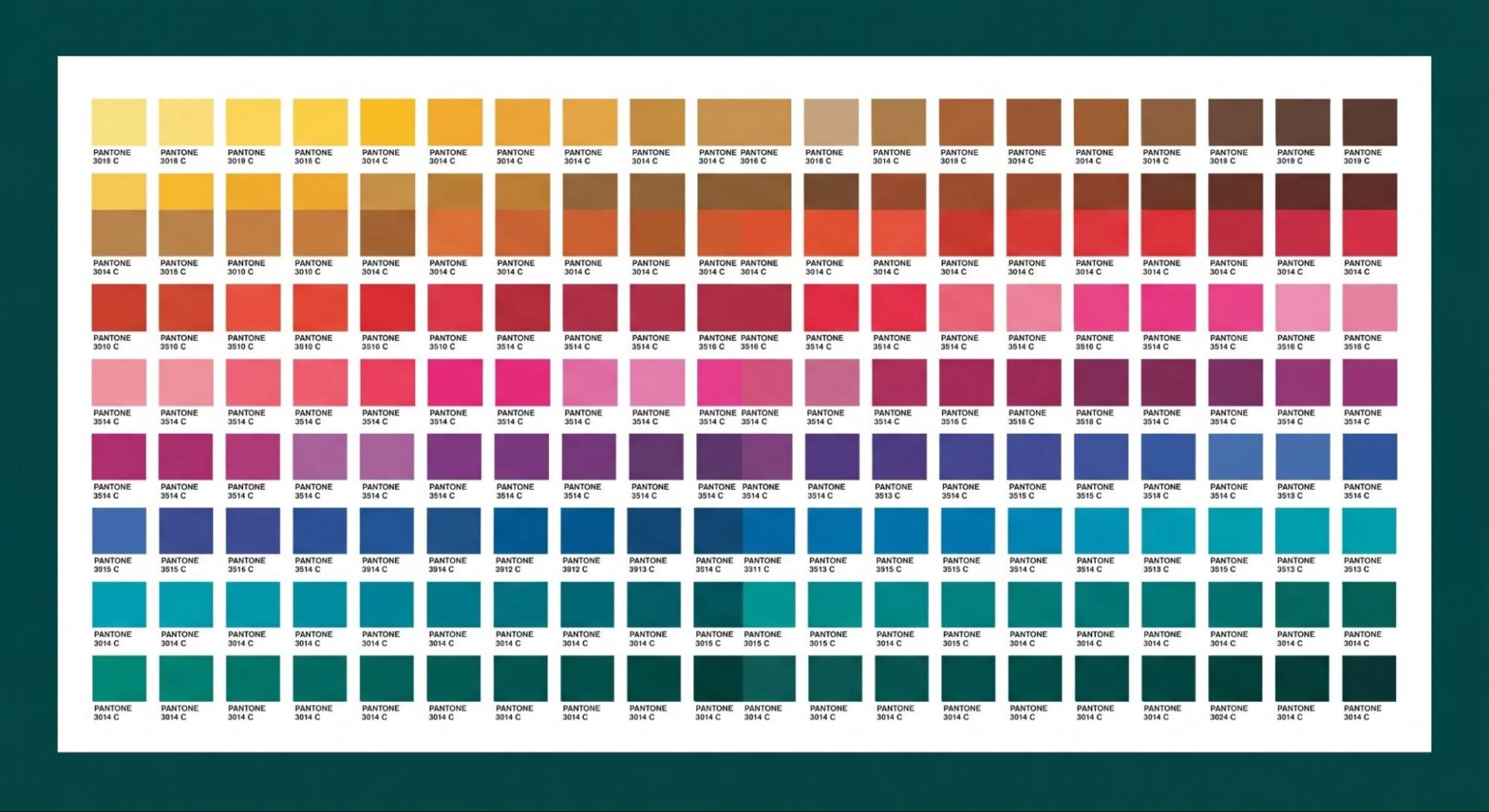
Pantone Solid Uncoated
The Pantone Solid Uncoated library represents colors on uncoated paper. It is more relevant when the intended stock lacks a gloss or coated surface. It can help buyers anticipate the softer appearance associated with absorbent material.
Pantone Color Bridge
The Pantone Color Bridge helps users compare a solid Pantone color with a process-color simulation. It is useful when a design must be adapted from spot color printing to CMYK or digital production. The comparison also shows why a converted color may not be identical to the original solid ink.
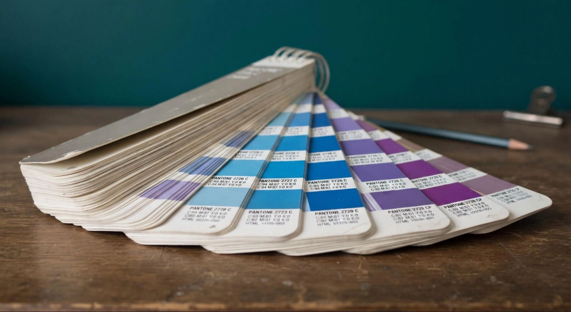
Digital Pantone libraries in programs such as Adobe Illustrator and Adobe Photoshop support artwork preparation. Still, a screen preview is affected by the monitor, brightness, calibration and software color settings. For print-critical approval, a current physical swatch and a representative proof provide more useful evidence than an on-screen view alone.
Pantone vs CMYK vs RGB vs HEX
Pantone, CMYK, RGB and HEX all describe color, but they serve different purposes.
| Color system | How it works | Primary use | Main strength | Main limitation |
|---|---|---|---|---|
| Pantone or PMS | Uses standardized color references and often dedicated spot inks | Brand-critical printing and solid colors | Provides a shared physical print target | Cost and press setup may increase |
| CMYK | Combines cyan, magenta, yellow and black process inks | Full-color commercial printing | Efficient for photographs and multicolor artwork | Cannot reproduce every Pantone color exactly |
| RGB | Combines red, green and blue light | Screens, cameras and digital media | Supports bright colors on illuminated displays | It is not a print ink model |
| HEX | Records RGB color as a digital code | Websites and user interfaces | Simple and consistent for digital design instructions | Does not define how ink will appear on paper |
Pantone vs CMYK
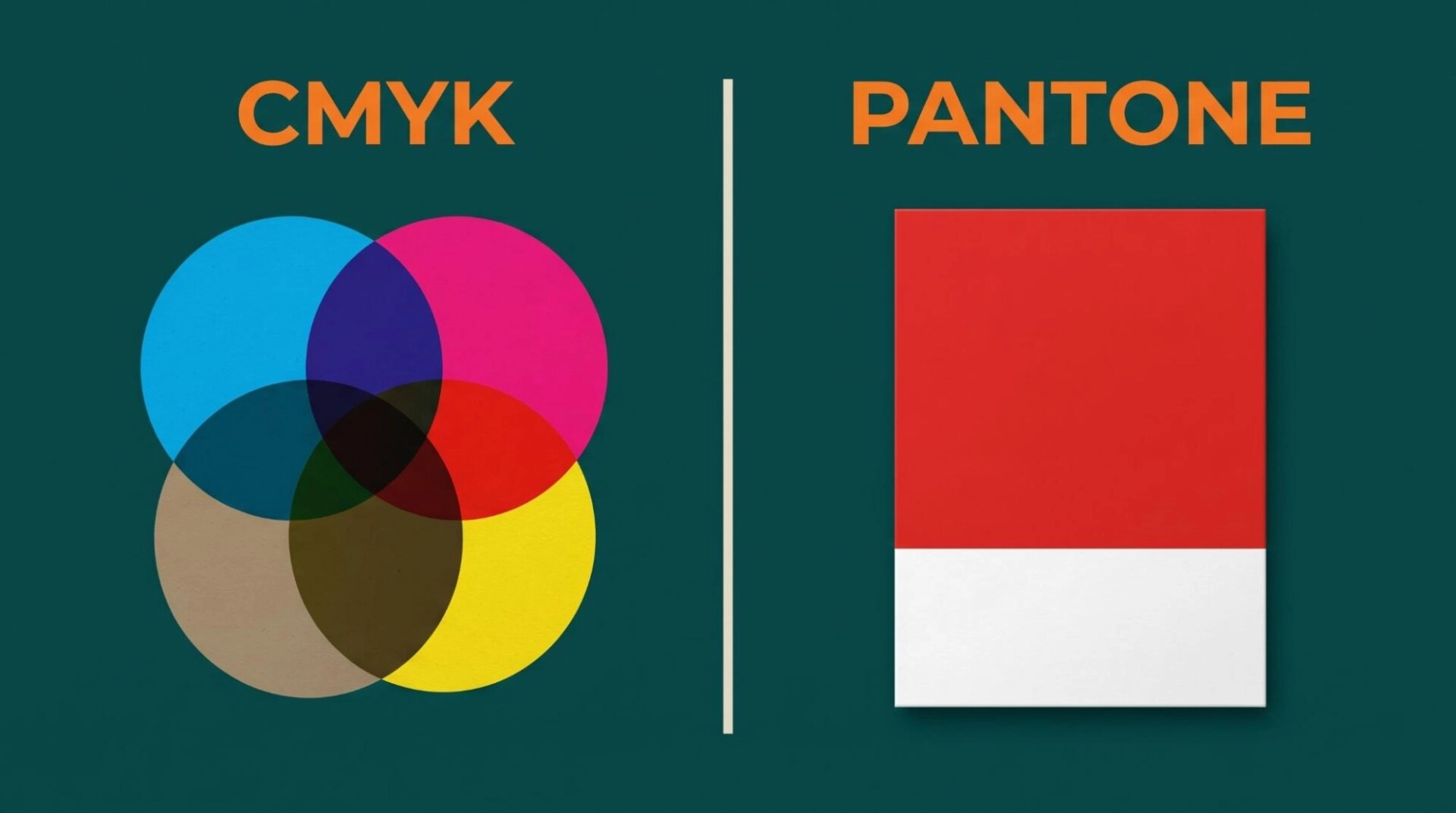
The main difference between Pantone vs CMYK printing is how the color is produced. A Pantone spot color is normally printed with a separate prepared ink. CMYK creates colors by placing combinations of four process inks in screened dots.
CMYK works well for photography, gradients and artwork containing many colors. Pantone spot colors are valuable when a design relies on one or two important solid colors. A packaging design can also combine CMYK photography with a separate Pantone ink for a brand logo.
Some Pantone colors fall outside the CMYK color gamut. Fluorescent, metallic and certain highly saturated shades are clear examples. A conversion can provide the nearest practical process build but not necessarily an identical result.
Pantone vs RGB and HEX
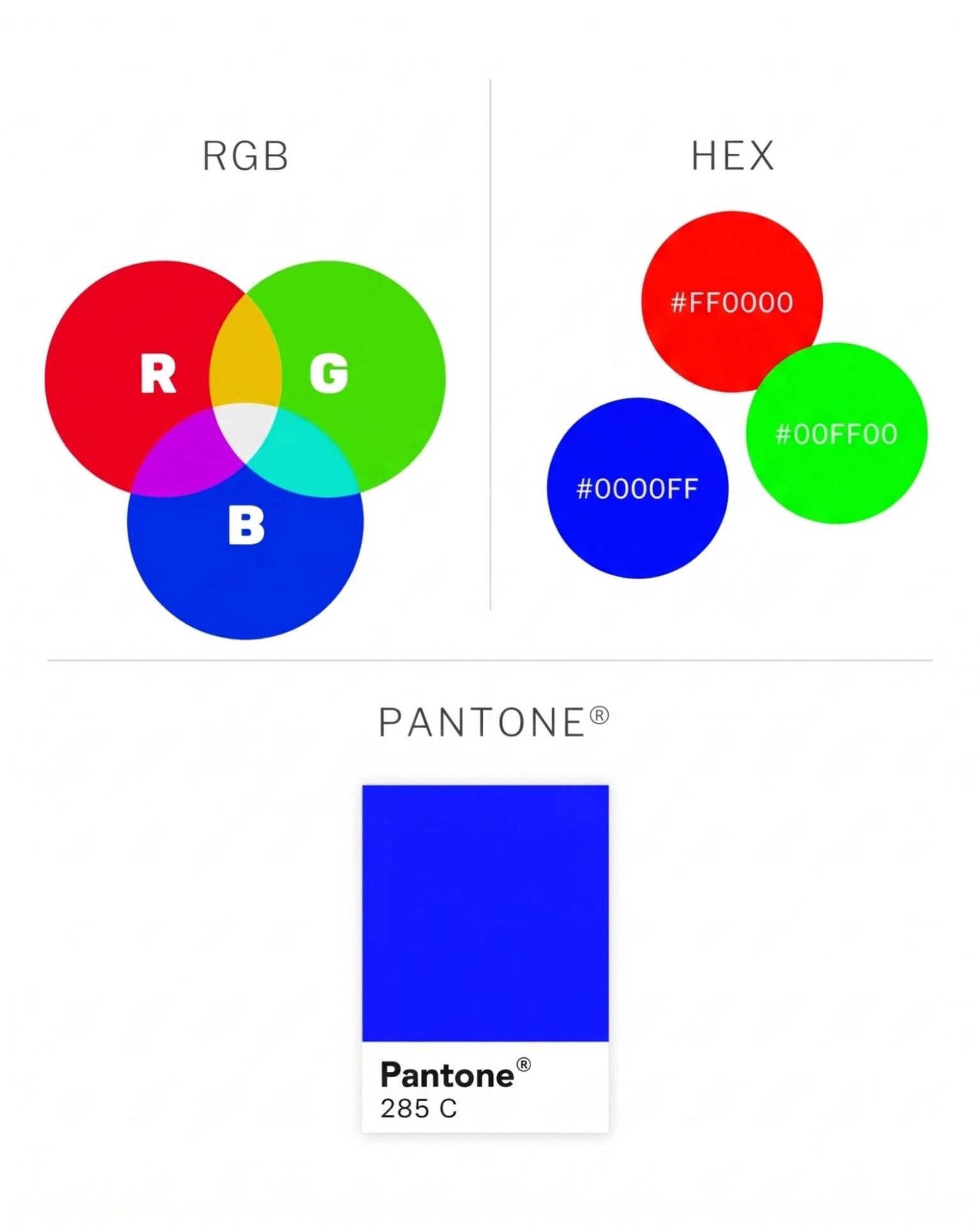
RGB and HEX define colors for digital displays. A screen emits light while printed packaging reflects it. A bright RGB color can lose intensity when converted to print because ink and paper cannot reproduce every color visible on a monitor.
HEX is a notation for RGB values. It is useful for website consistency but does not control printing ink, stock or coating. A brand should maintain separate approved specifications for digital and print use instead of expecting one code to perform both jobs.
Pantone Color Conversion
Pantone to CMYK, Pantone to RGB and Pantone to HEX values are best treated as translations for different media. They are not mathematical guarantees of identical appearance. The same principle applies to CMYK to Pantone conversion. A process build may not have one exact solid-color equivalent.
Always evaluate a conversion in its final context. Check digital colors on calibrated displays and print colors through a suitable proof on the intended material.
Pantone Spot Color vs Process Color
A spot color is printed separately using a prepared ink or dedicated color channel. A process color is created by combining CMYK inks. Each method solves a different production need.
| Project requirement | Usually suitable method | Practical reason |
|---|---|---|
| A critical solid logo color | Pantone spot color | Uses a defined reference and separate ink |
| Product photographs | CMYK process printing | Reproduces continuous-tone imagery |
| Artwork containing many colors | CMYK process printing | Builds a broad palette from four inks |
| Metallic or fluorescent effect | Suitable specialty ink | Standard CMYK cannot create the same effect |
| Short-run digital packaging | Calibrated process simulation | Avoids dedicated plate and ink setup |
| Full-color art plus a critical logo | CMYK plus a spot color | Handles imagery and brand color separately |
Spot color printing can improve control over an important solid shade. It can also increase plate, ink and wash-up requirements. CMYK may be more economical for complex multicolor artwork. The best choice depends on the design, print method, order quantity, material and required tolerance.
Why Pantone Colors Matter for Brand Identity
Brand colors help buyers recognize products across boxes, labels, displays and marketing materials. If those colors change noticeably from one order or supplier to another, the brand can appear less controlled.
Pantone color matching for brands reduces ambiguity. A documented reference gives designers and production partners a common starting point. This becomes especially useful when packaging is produced at different times or in different facilities.
Good brand color management should include more than a PMS number. A complete master specification can record the Pantone reference, CMYK build, RGB and HEX equivalents, approved substrates and acceptable variations. The digital values support screens while the Pantone and process specifications support print.
The goal is controlled consistency, not an unrealistic promise that every material will look identical. A blue printed on white coated board will not necessarily appear the same on brown kraft. A brand system should define how to handle those practical differences.
How Pantone Color Matching Is Used in Printing
Offset and Lithographic Printing
Offset or lithographic printing can use both CMYK and dedicated Pantone spot inks. It suits detailed graphics and consistent production across many paperboard packaging applications. Each spot color normally requires its own printing plate and press unit.
Flexographic Printing
Flexographic printing is widely used for corrugated packaging, labels, films and other packaging formats. Printers can prepare inks to work toward Pantone targets. However, plate material, anilox selection, ink type and substrate can all influence the printed color.
Digital Printing
Many digital presses reproduce Pantone references by combining available process inks or toners. This is a simulation rather than a separately mixed spot ink. Some equipment offers additional colors or expanded-gamut capabilities, but results differ by machine and material. A printed sample is important when the brand color is critical.
Screen and Specialty Printing
Screen printing and other specialty processes can use premixed colors for strong coverage or special applications. The ink system, curing method and surface must be considered before approving a target.
Pantone Color Matching for Custom Packaging
Pantone color matching for packaging is more complex than choosing a swatch. Packaging comes in different materials, structures and finishes. Each one changes the way color is printed or perceived.
Folding Cartons
Coated folding cartons provide a smooth surface for sharp details and saturated colors. SBS and other white paperboards give ink a relatively neutral base. Uncoated board produces a softer result and may need a different reference or proof.
Rigid Boxes
Rigid boxes often use printed or colored wrap over thick board. The wrap material affects the result more directly than the hidden greyboard. Matte, gloss and soft-touch lamination can also change color depth and contrast.
Corrugated Packaging
Corrugated packaging may have a white or kraft liner. Direct flexographic printing on brown kraft can mute or alter lighter colors. Litho-laminated corrugated boxes can produce more detailed artwork because a printed sheet is mounted to the corrugated structure.
Kraft has a natural brown base that shows through many inks. A printer may recommend white ink beneath the selected color, a more opaque ink system or an adjusted visual target. The correct solution depends on the printing process and desired appearance.
Films, Labels and Foil Materials
Transparent film, white film, metallic foil and paper labels reflect and transmit light differently. White ink may be needed beneath colors printed on clear material. Metallic stock can influence a color unless an opaque base separates it from the reflective surface.
Coatings and Finishes
Gloss lamination can make colors look deeper or more saturated. Matte and soft-touch films can reduce glare and alter perceived contrast. Aqueous coatings, varnish, UV coating and spot UV may also affect appearance. Foil stamping and embossing introduce reflective or dimensional elements that influence nearby colors.
For reliable Pantone color accuracy in packaging, approve the color together with the actual stock and finish whenever possible.
What Affects Pantone Color Accuracy?
Several variables influence Pantone color reproduction:
- Substrate color: White, cream, grey and brown materials create different bases beneath the ink.
- Surface texture: Smooth stock reflects light differently from textured or porous material.
- Absorbency: Uncoated paper can absorb more ink and reduce apparent saturation.
- Ink opacity: Transparent and opaque inks interact with the base material differently.
- Ink film thickness: A heavier or lighter deposit can shift the visible result.
- Printing method: Offset, flexographic and digital processes have different capabilities.
- Drying and curing: Some inks change slightly as they dry or cure.
- Lamination and coating: The final finish changes gloss, reflection and perceived depth.
- Lighting: Daylight, store lighting and office lighting can make colors appear different.
- Measurement conditions: Consistent instruments and procedures are needed for dependable comparisons.
This is why professional printers discuss an approved target and production tolerance rather than promising an absolute match under every condition.
Color Management, Proofing and Quality Control
Color management creates a controlled path from design to production. It does not make every device identical. It helps users predict differences and keep them within acceptable limits.
Monitor Calibration and ICC Profiles
A calibrated monitor provides a more reliable digital preview than a screen set by eye. An ICC color profile describes how a device or printing condition handles color. Profiles help software translate color information between devices, but a soft proof still cannot fully reproduce paper texture, metallic ink or surface gloss.
Color management creates a controlled path from design to production. It does not make every device identical. It helps users predict differences and keep them within acceptable limits.
Digital, Contract and Press Proofs
A simple digital PDF is useful for checking layout, text and placement. It is not a dependable physical color proof.
A calibrated hard proof can predict many process colors more accurately. However, it may only simulate a Pantone spot color. A press proof or production sample on the actual stock gives stronger evidence when color, material and finish are critical.
Buyers should ask what a proof is intended to verify. A structural sample may confirm size and assembly without representing final printing. A digital print sample may show artwork but not match an offset spot ink.
Digital, Contract and Press Proofs
Buyers should ask what a proof is intended to verify. A structural sample may confirm size and assembly without representing final printing. A digital print sample may show artwork but not match an offset spot ink.
Instrument-Based Measurement
A spectrophotometer measures reflected color. Printers can compare the measurement with a target and calculate a color difference. This difference is often expressed through a Delta E formula.
There is no single tolerance suitable for every job. The acceptable limit depends on the brand, color, material, printing method and measurement standard. The buyer and printer should agree on the evaluation method before a color-critical run.
Production Records
Keep the approved artwork, Pantone reference, ink information, substrate specification, finish and signed sample together. These records give future reorders a stronger starting point. They are particularly valuable if the order moves to another press or production facility.
How to Choose a Pantone Color
Use the following process when selecting Pantone colors for custom packaging:
- Define the purpose. Decide whether the color is a fixed brand asset, a seasonal shade or part of one campaign.
- Choose the packaging material. Color selection without the actual substrate can create false expectations.
- Use the relevant physical guide. Review coated or uncoated references according to the planned surface.
- Check the swatch under suitable light. Compare it under controlled light and, where useful, under the lighting expected at retail.
- Confirm the printing process. Ask whether the job will use a dedicated spot ink or process simulation.
- Test contrast and legibility. A color may look attractive as a large swatch but fail behind small text or a barcode.
- Review conversions. Check how the brand color translates to CMYK, RGB and HEX where required.
- Approve a representative proof. Evaluate the selected color on or close to the intended material and finish.
- Document the result. Save the complete specification and an approved production sample for repeat orders.
This process helps a brand find a Pantone color that works in real production, not only in a design file.
How to Specify Pantone Colors in Packaging Artwork
Clear files reduce prepress corrections and color errors. Follow these practical steps:
- Enter the exact Pantone library, number and suffix.
- Build the color as a spot swatch when true spot color printing is required.
- Use consistent swatch names throughout the file.
- Check separations to confirm that the spot plate remains separate.
- Avoid accidentally converting the spot swatch to CMYK.
- State whether the Pantone reference must be printed as spot ink or simulated.
- Record the substrate, coating, lamination and other finishes.
- Outline or package fonts according to the printer’s artwork requirements.
- Supply linked graphics and use the requested file format.
- Ask the prepress team to flag transparency, overprint and knockout conflicts.
The production specification should make the intended result clear even if the artwork is opened by someone who was not part of the original discussion.
Common Pantone Color Matching Mistakes
Choosing a Print Color from a Screen
An uncalibrated display is not a physical print standard. Use a relevant Pantone swatch and printed proof for important packaging colors.
Providing Only a Color Name or Number
“Red” is subjective and a base number without its suffix may be incomplete. Provide the full Pantone reference.
Treating CMYK Conversion as an Exact Match
A CMYK build may be the closest practical process alternative, but it may not reproduce the original spot color. Compare the conversion before approving it.
Ignoring the Packaging Material
Ink printed on white coated board can look very different on kraft stock. Select and approve color in relation to the substrate.
Approving Color Before the Finish
Lamination and varnish can alter color perception. Include the final coating in critical approvals.
Comparing Samples Under Different Lighting
Two samples may seem to match under one light source and separate under another. Use consistent viewing conditions.
Assuming Every Printing Process Has the Same Gamut
A digital press, offset press and flexographic press may reproduce the same target differently. Test the actual production route.
Failing to Keep an Approved Sample
A saved code is useful, but a signed physical sample provides important context for the next run.A saved code is useful, but a signed physical sample provides important context for the next run.Predictive maintenance can also monitor equipment performance. It helps production teams identify signs of wear before a machine stops unexpectedly.
Benefits and Limitations of the Pantone Color System
| Project requirement | Usually suitable method | Practical reason |
|---|---|---|
| A critical solid logo color | Pantone spot color | Uses a defined reference and separate ink |
| Product photographs | CMYK process printing | Reproduces continuous-tone imagery |
| Artwork containing many colors | CMYK process printing | Builds a broad palette from four inks |
| Metallic or fluorescent effect | Suitable specialty ink | Standard CMYK cannot create the same effect |
| Short-run digital packaging | Calibrated process simulation | Avoids dedicated plate and ink setup |
| Full-color art plus a critical logo | CMYK plus a spot color | Handles imagery and brand color separately |
When Should You Use Pantone Colors for Packaging?
Pantone spot colors are worth considering when a solid brand color is central to recognition, when artwork uses only a few colors or when the design requires a specialty ink. They can also help maintain a defined target across repeat offset or flexographic orders.
Before deciding, consider these questions:
- How critical is the color to the brand?
- Does the artwork include photographs or many shades?
- Is the selected color inside the process gamut?
- Which packaging material will be used?
- Which printing method suits the run size and structure?
- Will a special coating or lamination be applied?
- What level of variation is acceptable?
- Does the visual benefit justify any additional setup cost?
The best specification balances visual requirements, production capability and budget.
Pantone Color Matching for Custom Boxes at Hot Custom Boxes
Hot Custom Boxes helps businesses plan colors around the complete packaging specification. Our team can review the artwork, Pantone reference, box material, printing method and finish before production. This helps identify problems such as an unsuitable coated reference for an uncoated surface or a bright color that cannot be reproduced accurately through a selected process.
Depending on the packaging structure and order requirements, production may use offset, digital or flexographic printing. A color can be produced as a Pantone spot ink where the process supports it or simulated through an appropriate process workflow. Proofing options should be selected according to how critical the color is and what the sample needs to demonstrate.
When requesting custom boxes with Pantone colors, provide the full PMS reference and any approved brand guide or physical sample. Also explain whether the color has been used successfully on the same type of material before. These details help establish a realistic and repeatable production target.
Treat Color as a Complete Print Specification
The Pantone Color Matching System gives brands and printers a clear language for color. It supports better identification, communication and quality control than informal color names or screen previews alone.
Successful color production still depends on the full specification. The Pantone reference, material, printing method and final finish must work together. Proofing and an agreed tolerance then turn that specification into a practical production standard.
If you are planning custom packaging, discuss these decisions before approving the artwork. Hot Custom Boxes can help you select a suitable printing approach and prepare your color requirements for custom boxes, cartons and other printed packaging.
Frequently Asked Questions
The Pantone Color Matching System is a standardized method of identifying and communicating colors. Designers and printers use Pantone references to work toward a shared color target in branding and print production.
A color is selected from a relevant Pantone guide and recorded with its complete reference. The printer then produces it as a spot ink or an agreed process simulation. Proofing and quality checks compare the result with the approved target.
Not necessarily. Coated and uncoated papers absorb and reflect ink differently. Pantone C and U references show how related colors appear under those different conditions.
Pantone often defines a solid spot color printed with a separate ink. CMYK builds colors from cyan, magenta, yellow and black dots. CMYK suits photographs and multicolor artwork while Pantone can provide better control for selected solid colors.
Digital presses can simulate many Pantone colors, but their achievable gamut varies. Some colors will reproduce more closely than others. Request a printed sample when accuracy is important.
Yes, practical conversions are available, but they are approximations for different media. A converted value should not be assumed to look identical to the original spot color.
Screens use RGB light and vary by calibration, brightness and display technology. Pantone print references use physical ink on a material. The two viewing methods have different color gamuts and visual behavior.
Start with the intended packaging material and printing method. Review the correct physical guide under suitable lighting. Then request a representative proof that includes the planned substrate and finish.
They can change perceived depth, gloss and contrast. Approve color with the final finish whenever it is important to the brand.
Send the complete Pantone reference, print-ready artwork, substrate details, finish requirements and any approved physical sample. State whether you expect a true spot ink or a process simulation.
A Color Is Selected from a Relevant Guide
Finishing choices should match the product position and packaging material. Some films and mixed coatings can make recycling more difficult. Businesses should balance appearance, protection, cost and end of life disposal.