












Related Products
$10.00 Original price was: $10.00.$5.00Current price is: $5.00.
In Stock
$10.00 Original price was: $10.00.$5.00Current price is: $5.00.
In Stock
$10.00 Original price was: $10.00.$5.00Current price is: $5.00.
In Stock
$10.00 Original price was: $10.00.$5.00Current price is: $5.00.
In Stock
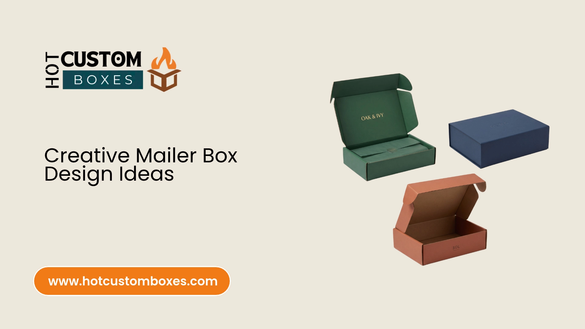
Table of Contents
Get A Free Quote
A bright printed lid. A hidden message inside. A fitted tray that arranges every product neatly. Small design choices can give a mailer box its own personality.
These 17 creative mailer box design ideas explore color, artwork, texture and product presentation. Each idea includes a visual direction and a product example. Use them as inspiration for custom packaging that reflects your brand.
1. A Bold Single Color Mailer With a Contrasting Logo
Cover the main lid and side panels in one recognizable brand color. Add a contrasting logo to make the brand name easy to spot. Keep the surrounding artwork simple so the color becomes the main feature.
A cobalt blue box with white lettering creates one direction. A coral box with dark brown lettering creates another. You can use the same layout across several sizes. This gives your product packaging a consistent appearance.
Design example: A fitness accessories brand could use electric blue custom mailer boxes. A white logo sits in the center. A small orange symbol appears on the front flap. Inside, orange outlines frame the accessories.
Carry the same accent onto a card or product sleeve. This connects the outer color with the contents. A short printed phrase inside the lid can finish the design.
This idea suits apparel, sports accessories and lifestyle products. It gives you a clear starting point without requiring detailed illustrations.
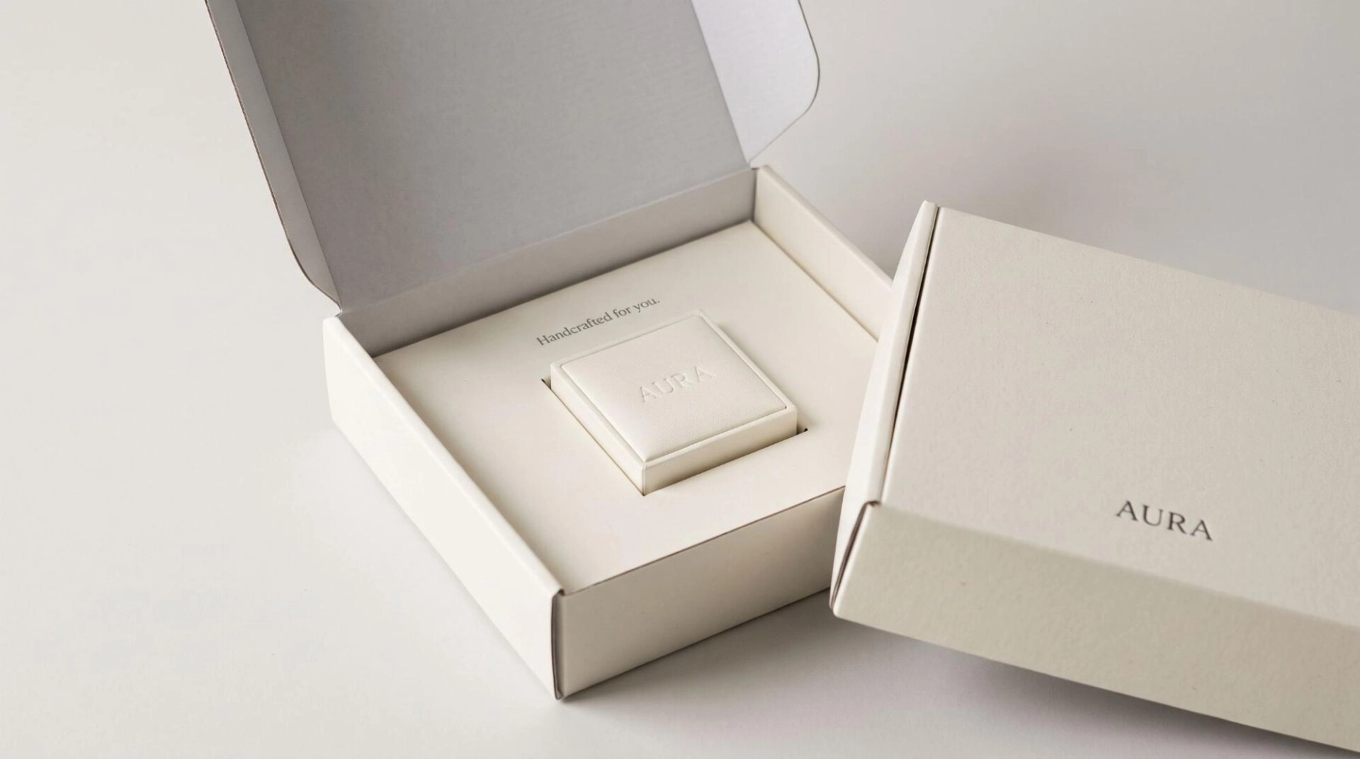
2. Minimalist White Mailers With a Small Off Center Logo
Use a white or warm cream background with a small logo. Place the logo slightly away from the center. Leave generous open space around it.
This creates a quiet layout that lets the product take attention during opening. Fine borders or a single line of text can add detail. Keep those elements smaller than the main brand mark.
Design example: A jewelry brand could use an ivory mailer with a charcoal wordmark. Position it near the lower right corner. Inside, a matching ivory insert holds a small jewelry box. A short message appears above the product.
A subtle gray interior can provide gentle contrast. Another option is a plain white interior with a colored card. Both keep the presentation restrained.
Minimalist mailer box design also suits premium stationery and personal care products. The key is consistent placement. The logo, insert and card should look deliberately arranged.
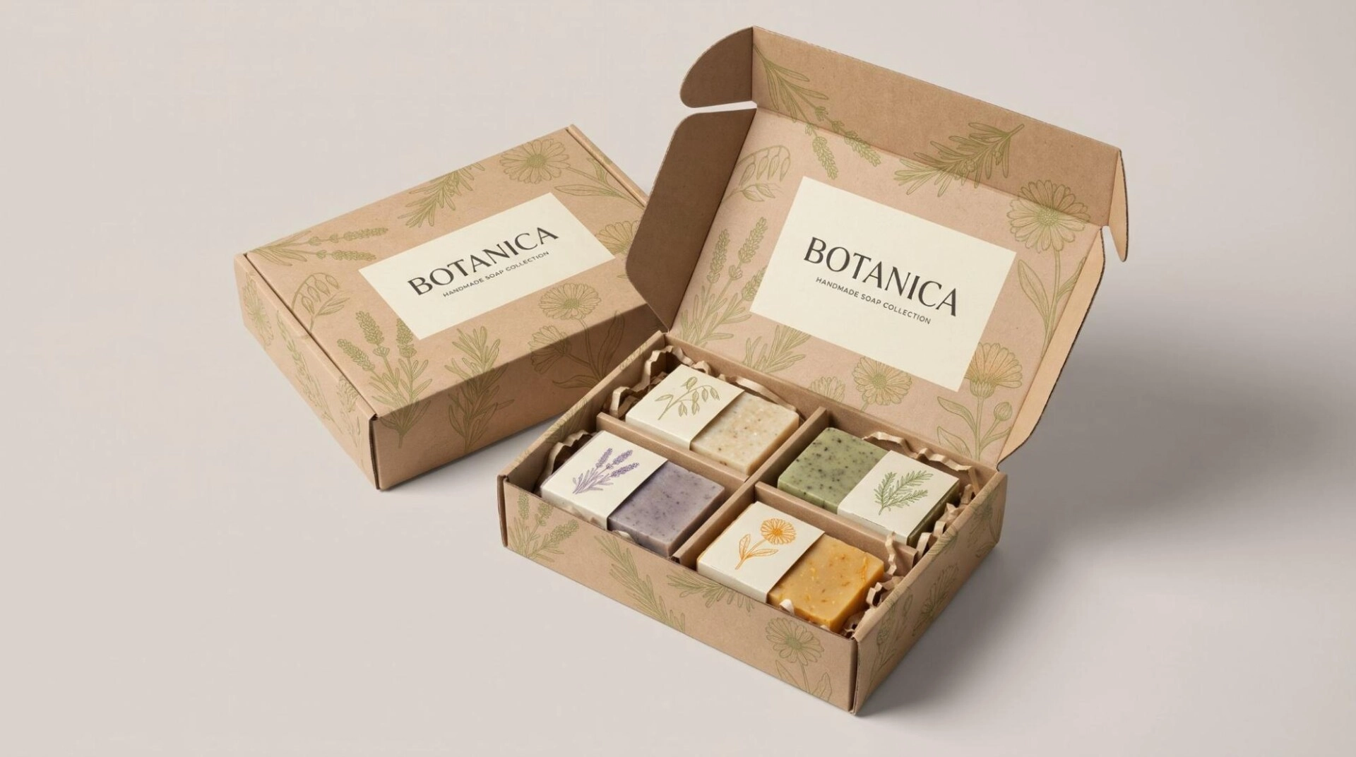
3. Illustrated Kraft Mailers With Product Inspired Drawings
Let the brown kraft surface act as the background. Add line drawings that show what the product contains or how customers use it.
A tea brand can use cups and loose leaves. A sewing kit can show scissors, thread and needles. The illustrations should connect directly to the contents.
Design example: A handmade soap collection could use brown kraft mailer boxes. Olive green drawings show the actual botanical ingredients. A cream label area holds the brand name. Inside, each soap sits beside a small matching ingredient illustration.
Keep the drawings light enough to leave some brown paper visible. This gives the artwork breathing room. A dark logo can provide the strongest visual point.
For another variation, use white linework on kraft where the printing process supports it. The result offers a different contrast from dark ink.
These mailer packaging ideas suit handmade products, tea gifts and selected skincare collections.
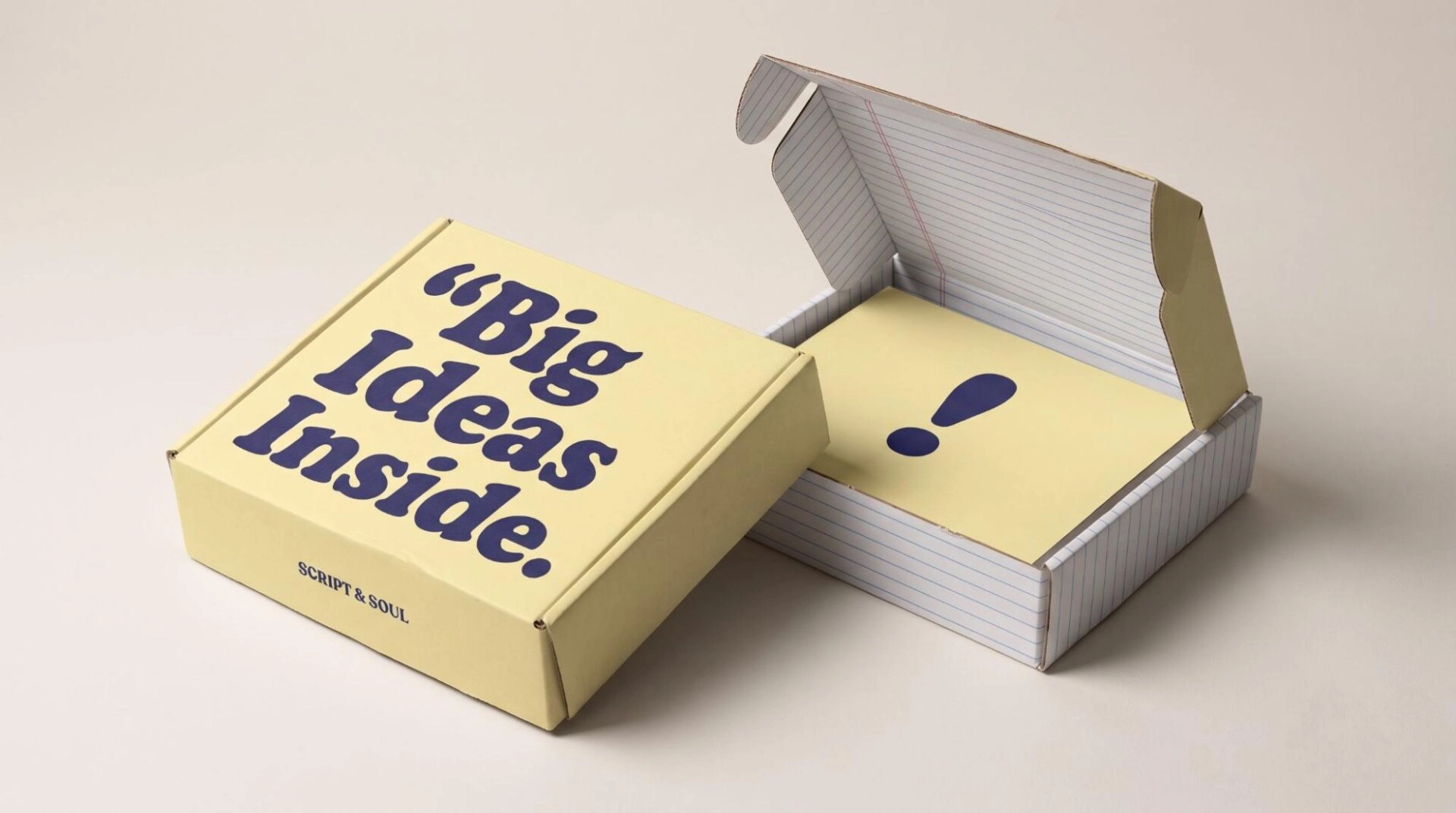
4. Oversized Typography That Becomes the Main Design
Make a word or short phrase the largest element on the box. Treat the lettering as artwork. Its shape and scale can provide enough visual interest without extra illustrations.
Choose a phrase that fits the product. A notebook brand might use “Start Something.” A craft kit could use “Make It Yours.” Keep the message short enough to read at a glance.
Design example: A stationery brand could print “Big Ideas Inside” across a pale yellow lid. The words use dark blue lettering. A small brand name sits on the side panel. Inside, blue notebook lines continue around the product tray.
The typeface sets the mood. Rounded letters can feel playful. A strong serif can create an editorial appearance. Retro lettering can support a nostalgic design.
Repeat one letter shape or punctuation mark on the card. This links the interior to the main lid.
Typography focused custom mailer box design suits stationery, books and creative subscriptions.
5. A Repeating Pattern Made From Brand Icons
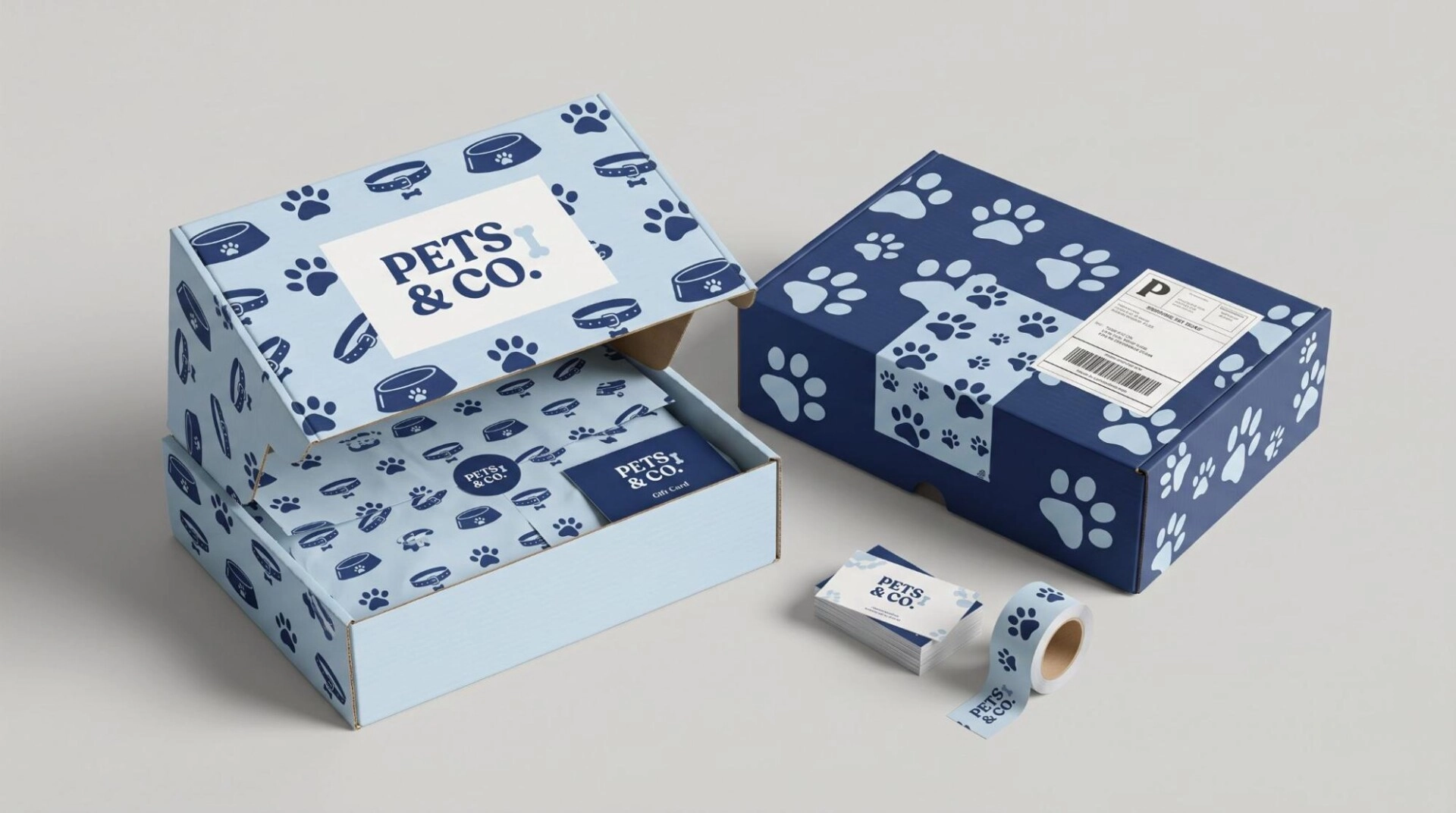
Create a pattern from a few small symbols. Repeat them across the lid and sides. Leave a quieter space for the logo.
The symbols might come from your product, brand mark or illustration style. Use a limited set so the pattern feels connected. Different spacing can make the same icons feel lively or restrained.
Design example: A pet accessories brand could use bowls, collars and paw shapes. Print them in navy on a pale blue box. Place the logo inside a solid white rectangle. A smaller version of the pattern appears on the tissue paper.
Another variation uses one brand symbol in different sizes. Rotate selected symbols to create movement. Keep their shapes recognizable.
A repeat pattern can adapt to different box sizes. It can also continue onto labels and cards. This makes it useful for a growing product range.
Patterned mailer boxes work well for playful accessories, gift sets and subscription packaging.
6. Color Blocked Mailers for Different Product Collections
Divide the lid into two or three clear color areas. Use the shapes to frame the logo or identify a product collection.
Large rectangles can create a direct graphic style. Curved blocks can soften the layout. An angled band can suggest movement across the lid.
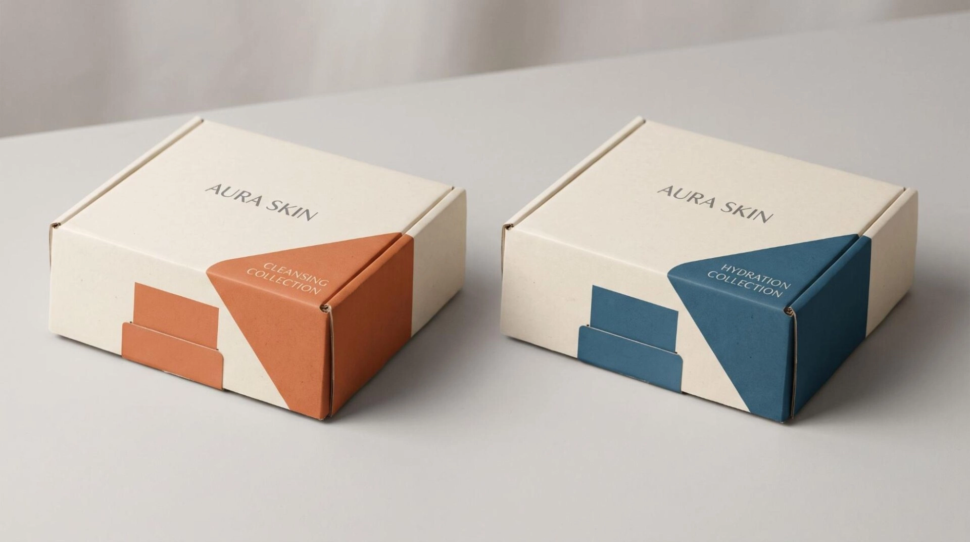
Design example: A skincare brand could use a cream box with a terracotta corner. That version carries its cleansing collection. A second version uses a blue corner for hydration products. The logo stays in the same position on both.
Print the collection name within the colored area. Repeat that color on a card or insert tab. This gives each version its own identity.
The idea also suits coffee assortments, candles and apparel collections. One base layout can serve several SKUs.
For mixed orders, keep the outer colors neutral. Use colored interior cards to identify the individual products. This preserves the visual system across different order combinations.
7. A Continuous Scene Across the Lid and Side Panels
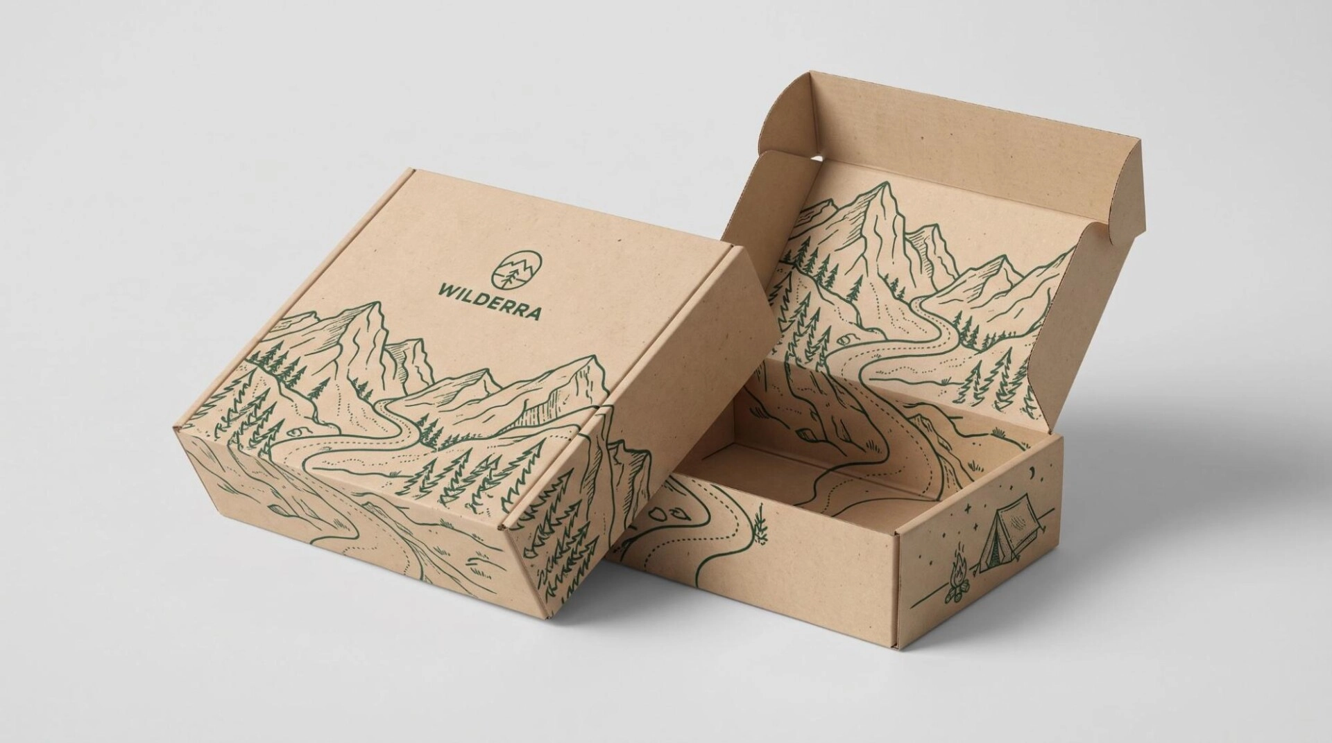
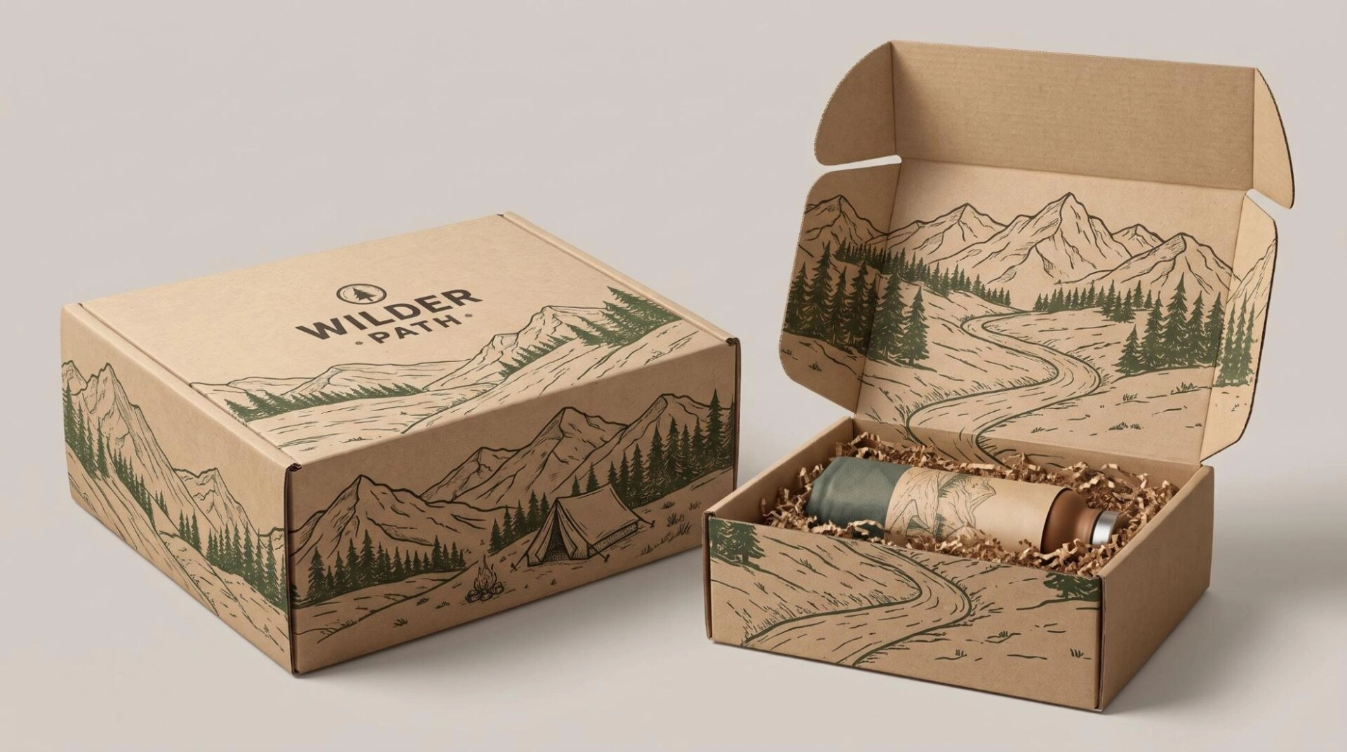
Create an illustration that travels around the package. The lid shows the main scene. The sides reveal related details.
A flowing ribbon, landscape or abstract line can connect several panels. This gives the customer something different to see as the box turns.
Design example: An outdoor accessories brand could show a mountain trail across the lid. The trail continues down one side. A small tent appears on the opposite panel. Inside, the trail ends beside the product.
Use a consistent line style throughout the scene. Keep the logo in a calm section of the artwork. The illustration can provide movement while the brand name stays easy to read.
A travel gift set could use a cityscape instead. A seaside collection might use waves and shore details.
This mailer box design idea suits travel accessories, themed gifts and illustrated product ranges. Plan the scene around the folded panels so each view works on its own.
8. A Storybook Interior With Illustrated Brand Details
Turn the inside lid into a short illustrated story. Use a few small scenes rather than a long paragraph.
The story might show how a product is made. It could introduce a craft process or explain a useful feature. Keep the details specific to the business.
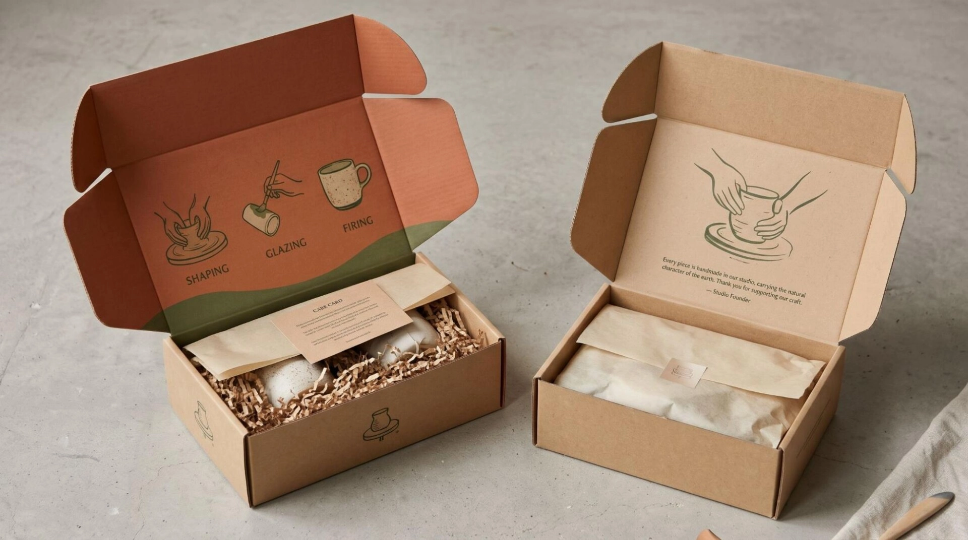
Design example: A ceramic studio could show three simple illustrations. The first shows shaping clay. The second shows glazing. The third shows the finished cup. Short captions explain each stage.
The exterior can carry a small symbol from the story. Opening the box then reveals the full sequence. A matching care card can sit beneath the lid.
Another approach uses one main illustration and a brief founder message. This can suit a handmade product with a clear origin story.
Story based interior printing gives the customer something meaningful to read. It suits artisan products, small batch collections and craft kits. Use accurate details rather than decorative claims about the business.
9. A Plain Exterior With a Bright Surprise Inside
Keep the outside quiet and introduce the strongest color inside. This makes opening the package the main visual change.
The exterior might use kraft, cream or light gray. The interior can reveal a bright pattern, color field or large illustration.
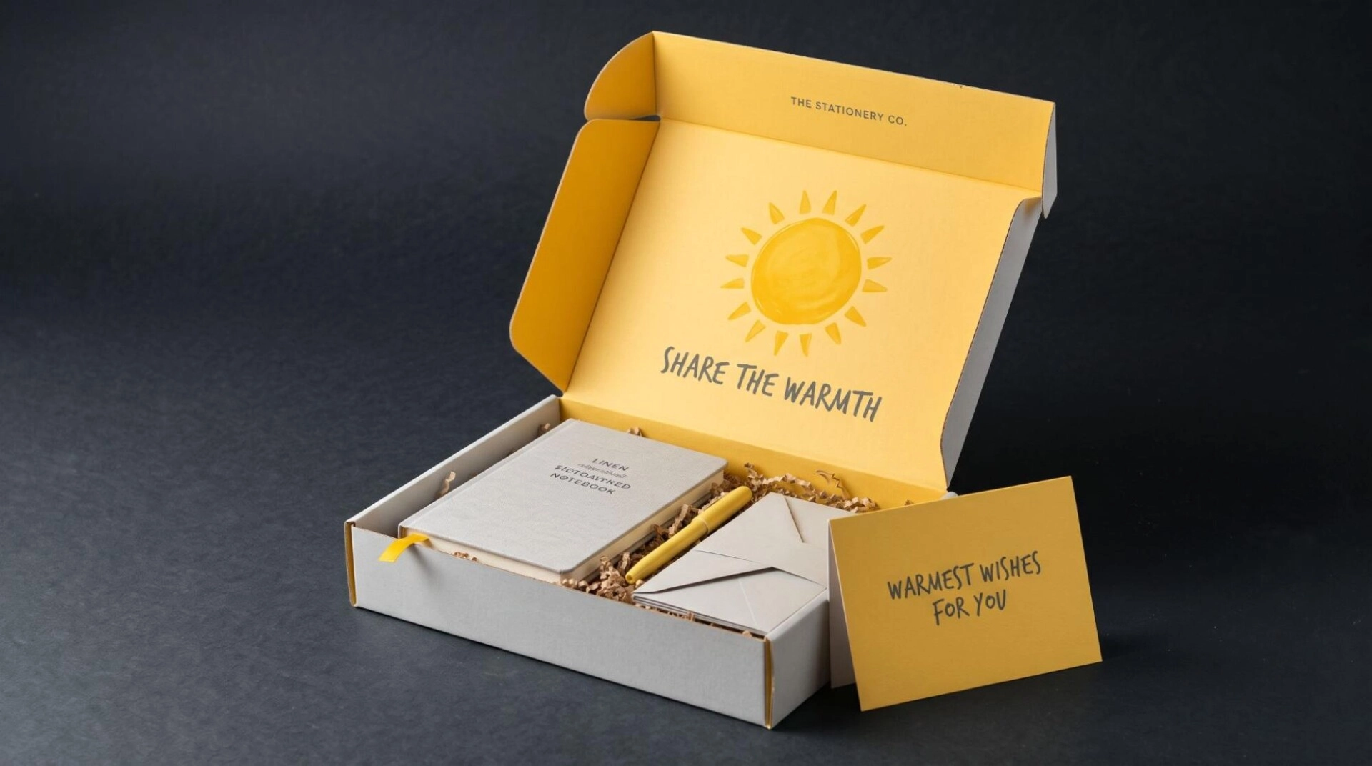
Design example: A stationery gift set could use a pale gray outer box. Inside, a yellow sun fills the lid. A matching yellow card rests beside the notebook. Dark gray lettering connects the inside and outside.
You can also reverse the color relationship. A colorful exterior might open to a calm white interior. That quieter background can draw attention to detailed products.
Choose colors around the actual contents. A contrast between the product and insert helps each item remain visible.
This is one of the creative mailer box design ideas that suits many categories. Beauty kits, gifts and creative subscriptions can all use a planned interior reveal.
10. Printed Inserts That Create a Product Display
Make the insert part of the artwork. Use its color, shape and printed details to frame the contents.
Arrange the products in a clear visual order. The main item can sit in the center. Smaller pieces can follow a line or curve around it.
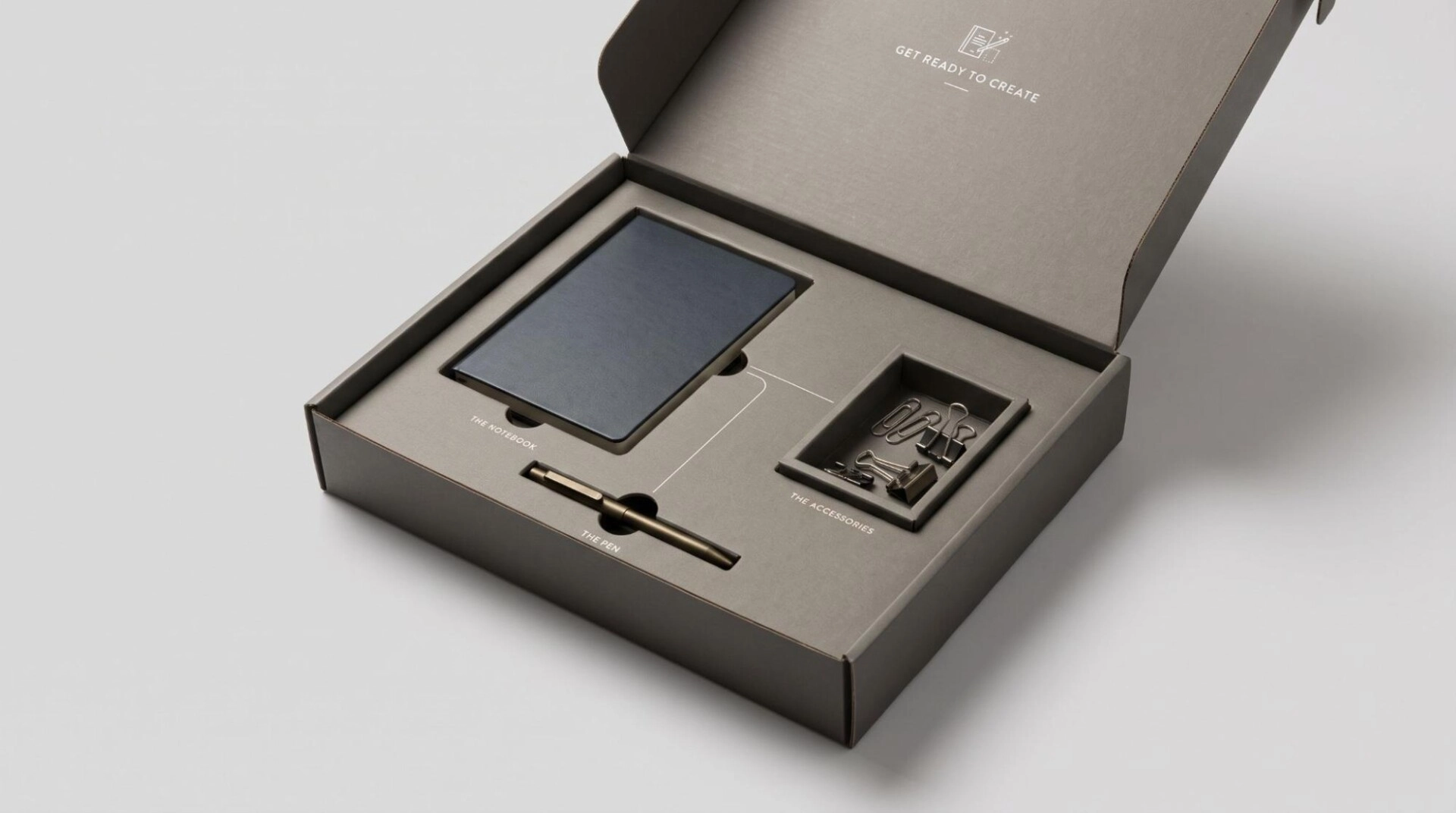
Design example: A desk kit could place a notebook beside a pen. A small tray holds clips. Printed lines connect the three areas. Short labels identify each item.
A beauty set could use numbered cavities. Each number shows a step in the routine. The inside lid repeats the same sequence with small illustrations.
Custom inserts can also reveal artwork after product removal. A message beneath the main item adds a second discovery.
Mailer boxes with inserts need a suitable protective design. Build the artwork around the insert that holds the products securely.
This approach suits multi item kits, cosmetics, stationery and carefully arranged gifts.
11. Branded Tissue Paper With a Matching Seal
Create a layered opening with coordinated tissue paper. The customer opens the mailer, sees the wrapping and then reveals the product.
Choose tissue that complements the box. A small printed pattern can echo the outer artwork. Plain tissue can also work with a distinctive seal.
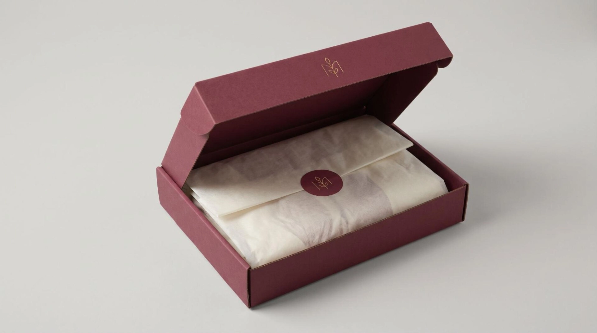
Design example: A scarf brand could use a burgundy mailer. Ivory tissue wraps the garment. A burgundy circular sticker closes the fold. The sticker carries the same small emblem as the lid.
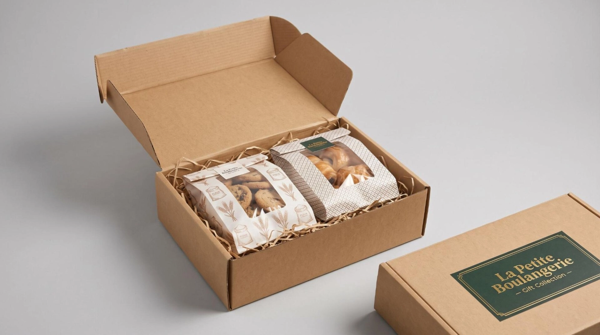
A bakery gift collection could use patterned wrapping around sealed inner packs. A fashion brand might use a wide paper band instead of a sticker.
Keep the seal easy to remove. The wrapping should feel like a planned part of opening the package.
Tissue supports presentation and light surface separation. Breakable products still need appropriate cushioning.
This idea gives apparel mailer boxes and gift packaging a coordinated interior without covering every box panel in print.
12. Personalized Cards That Match the Mailer Artwork
Add a card designed around the recipient or occasion. Keep the outer mailer consistent and personalize the interior.
The card can include a name, gift message or welcome note. Its colors and lettering should match the box. This makes it feel like part of the package.
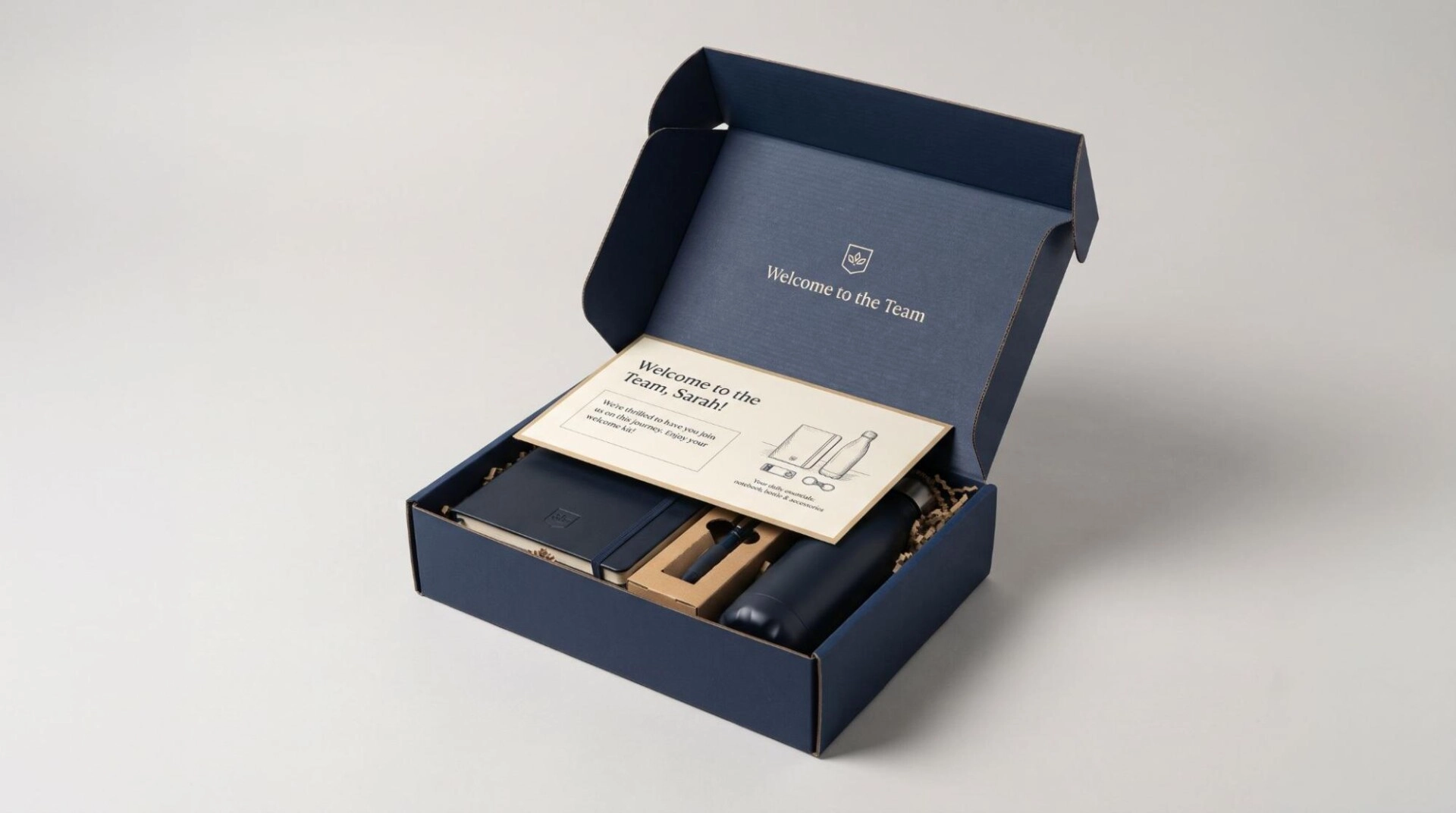
Design example: A corporate welcome kit could use a navy mailer. Inside, a cream card carries the employee’s first name. A small illustration introduces the notebook, bottle and accessories.
For a gift order, the card could show the sender’s message. A subscription could use a short note connected to that month’s selection.
Use a defined message area so different text lengths fit neatly. A separate card gives more flexibility than changing the whole box.
Personalized mailer packaging suits welcome kits, event gifts and special orders. Keep personal details inside the package where practical. Match each card carefully to the intended recipient.
13. Matte Black Mailers With Glossy Spot UV Details
Use contrast between a matte surface and selected glossy areas. The design changes as light moves across it.
A spot UV treatment can highlight a logo, line pattern or symbol. Keep the effect concentrated so it remains easy to notice.
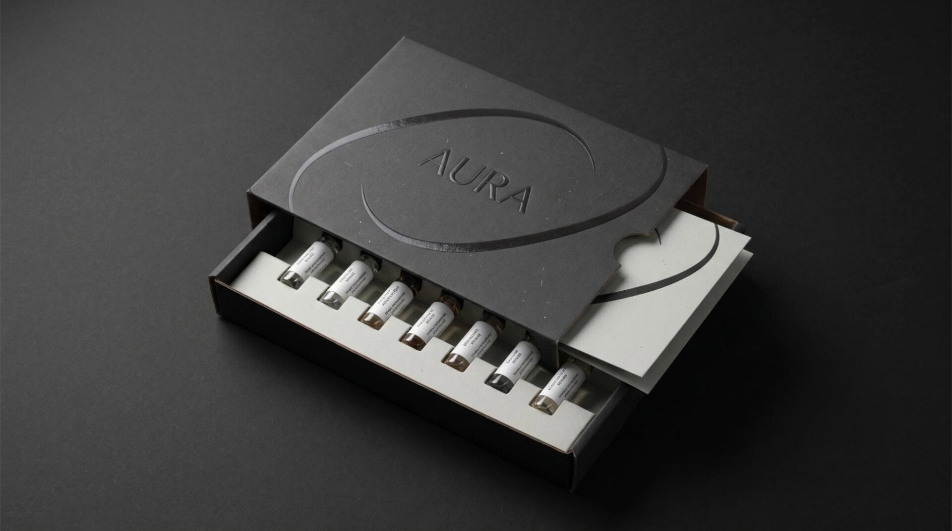
Design example: A fragrance discovery kit could use a matte charcoal lid. A glossy curved line surrounds the brand name. Inside, a pale insert keeps the bottle labels clear. A matching card repeats the curve.
Black on black is one option. Dark green with glossy botanical shapes creates another. You can also use a lighter matte background with a gloss accent.
A soft touch treatment offers a different tactile direction. It can add a smoother feel where the selected production process supports it.
These premium mailer box design ideas suit fragrance, accessories and gift collections. Review a physical finish sample. A screen cannot show the final texture or reflected light.
14. A Small Foil Accent With Embossed or Debossed Detail
Give one part of the design a reflective finish. A small foil symbol can draw attention without filling the lid.
Gold, silver and copper offer different visual directions. Match the foil to the product labels or other package details.
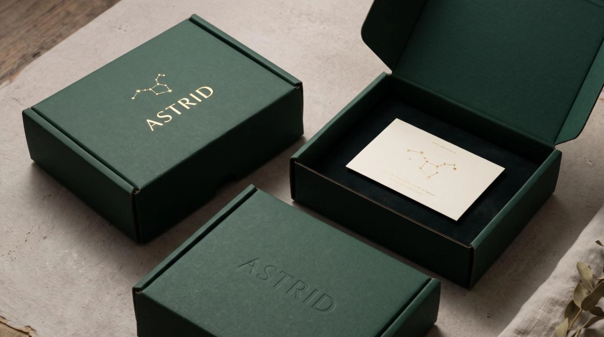
Design example: A jewelry gift mailer could use a deep green background. A small gold constellation sits above the wordmark. Inside, the same constellation appears on a cream card.
Embossing can raise a selected symbol. Debossing can press it inward. These effects create relief. Foil adds reflection and does not automatically create that relief.
Another version could use a debossed wordmark without foil. This keeps the color palette quiet while adding texture.
Some effects work better on a separate printed liner or wrap. Match the technique to the board construction.
Use this luxury mailer box design for jewelry, premium stationery and selected limited collections. Let the special detail remain the main accent.
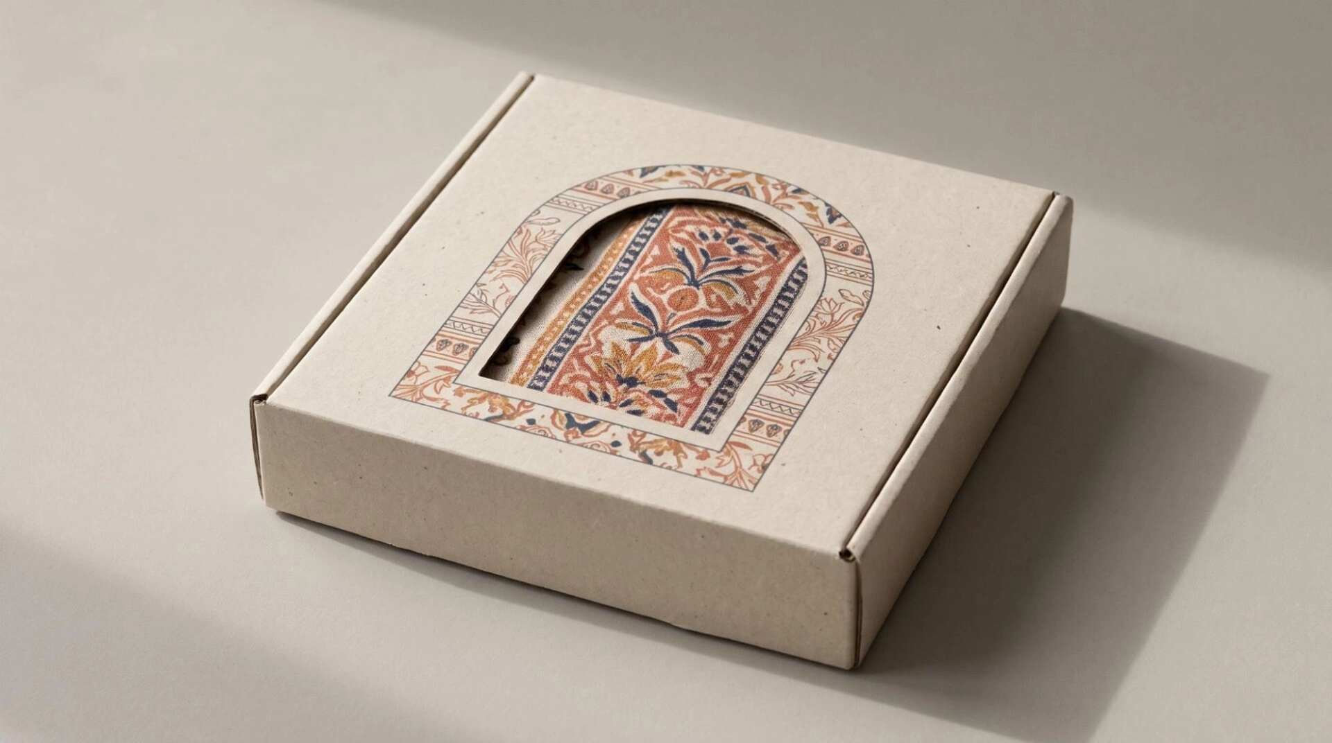
15. A Geometric Window That Frames a Product Detail
Use a window as part of the composition. The opening can reveal color, texture or a recognizable feature.
Choose a shape connected to the artwork. A circle can frame a label. An arch can reveal a textile pattern. A small rectangle can show a product name.
Design example: A textile gift brand could use an arched window. It reveals part of a patterned scarf. Printed lines around the opening continue the fabric’s visual rhythm.
Keep the product positioned behind the opening. The reveal should look deliberate rather than showing an empty gap.
A window removes board and changes product exposure. A film covered opening introduces another material. A windowed presentation box may need a protective outer shipper.
This idea suits selected retail gift packs and presentation kits. For a fully closed alternative, use a shaped finger notch as a design detail. Pair it with artwork that clearly shows where to open.
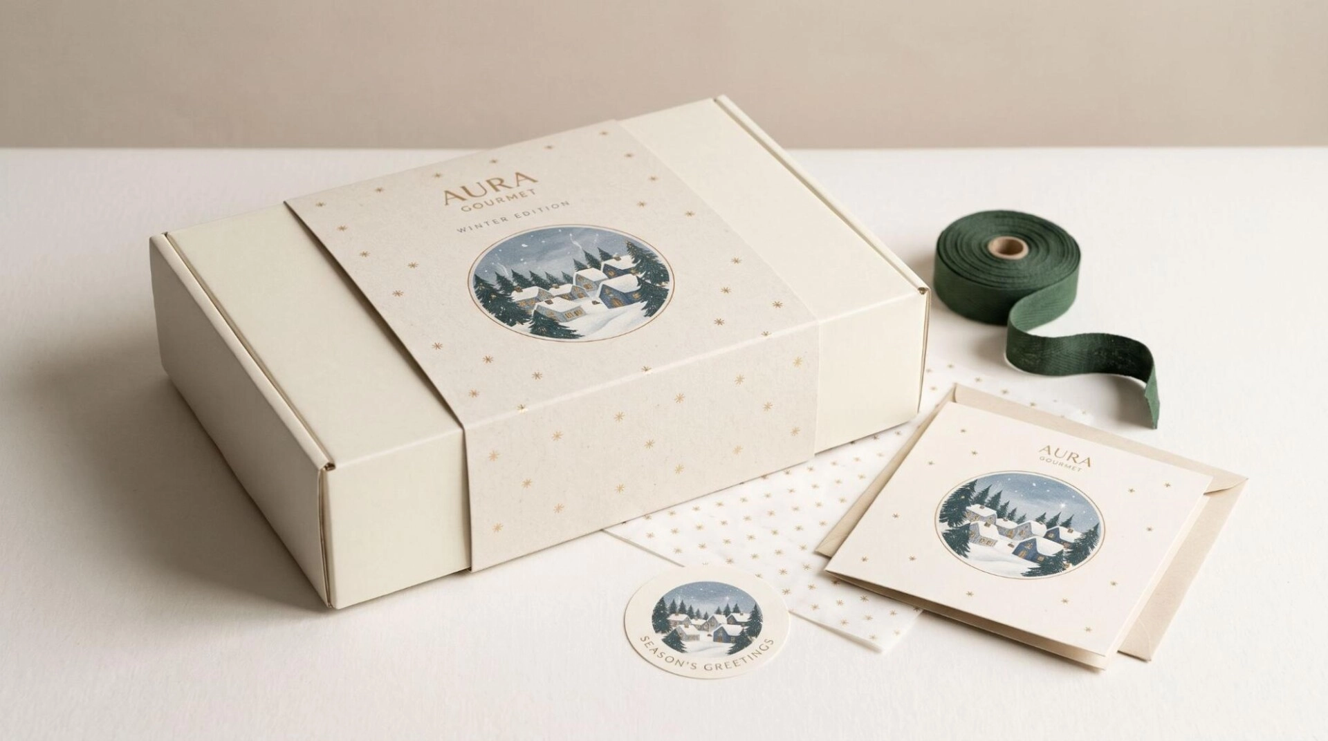
16. Seasonal Sleeves and Limited Edition Lid Designs
Adapt a familiar mailer for a particular collection. Keep the basic identity consistent and introduce artwork linked to the occasion.
A sleeve can carry the seasonal design. A defined lid area can also change between editions.
Design example: A gourmet gift brand could use a cream mailer with a circular illustration. Winter versions show a snowy village inside the circle. Spring versions use flowering branches. The logo stays above the artwork.
Holiday mailer boxes can use matching gift cards and seals. A Christmas edition might repeat a small star motif across those components. A Valentine’s collection might use a different palette and message.
Limited editions can also feature a real artist collaboration. A card can introduce the artwork and collection.
Keep dated details on replaceable parts when useful. This lets a standard box serve later campaigns. The idea suits seasonal gifts, subscription boxes and genuine limited product releases.
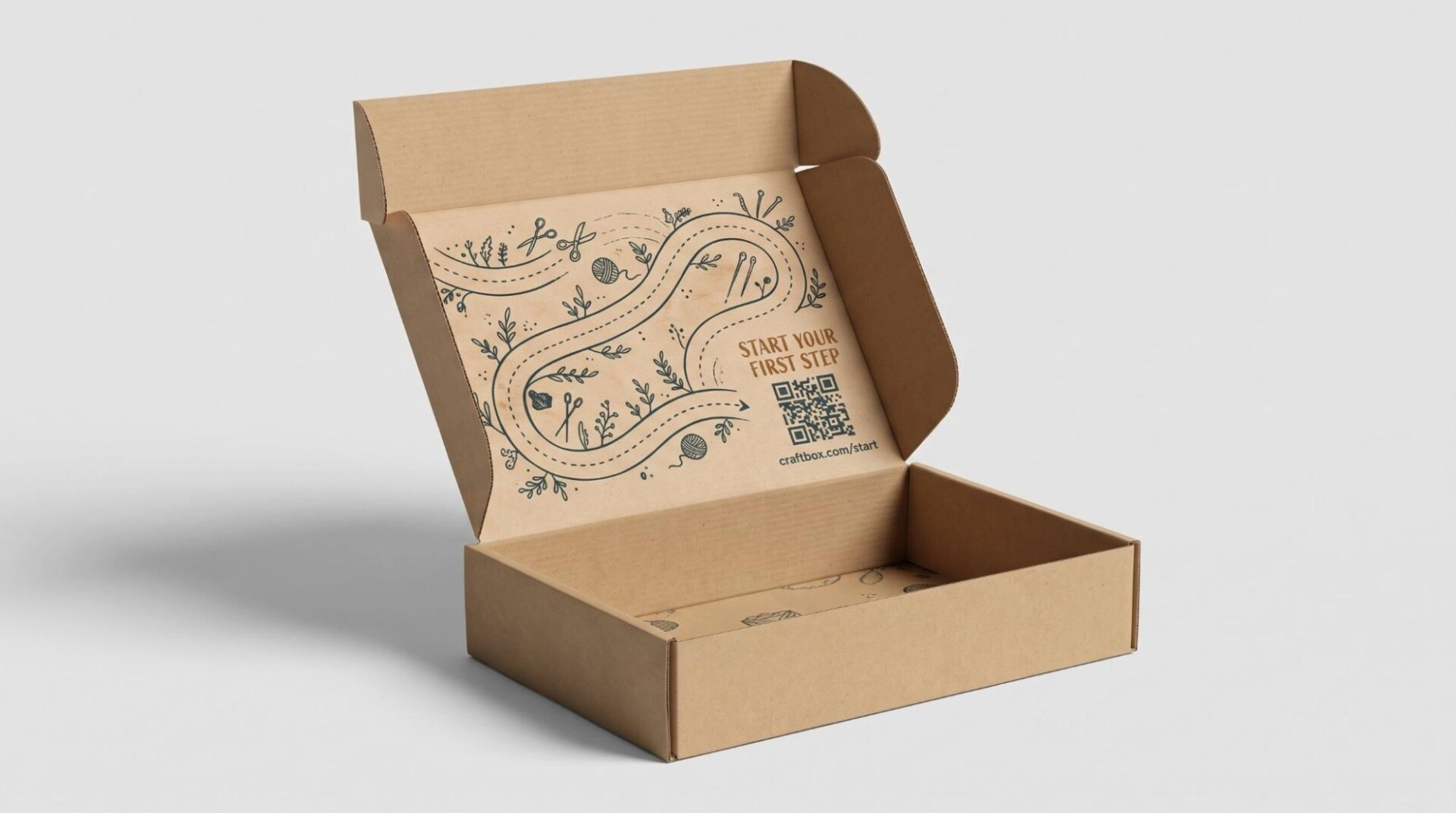
17. Interactive Artwork With a Useful QR Code
Build a QR code into a purposeful graphic. Make its destination part of the design idea.
A code can sit beside a small illustration or short instruction. Tell customers what they will receive after scanning.
Design example: A craft subscription could show a printed path inside the lid. The path leads to a code labeled “Start Your First Step.” Scanning opens the tutorial for the enclosed project.
A cooking gift kit could link to a recipe. A plant care set could open an illustrated care guide. An electronics kit could provide setup instructions.
Keep the code on a flat area with clear space around it. Use a printed sample to test scanning. Add a short web address as another route.
Interactive mailer box design works best when the destination helps the customer use the product. Keep that page available after the campaign. The packaging may remain useful long after delivery.
Bring Your Mailer Box Design Idea to Life With Hot Custom Boxes
Create custom mailer boxes that reflect your products and brand. Share your preferred design with Hot Custom Boxes. Get logo printing and free design support. Start with 50 boxes or request wholesale pricing for bulk orders. Enjoy quick turnaround and free shipping. Call +1 (332) 263-6086 or +1 (720) 604-9515. Email [email protected] for your custom quote.
Frequently Asked Questions
Start with your brand name or logo. Add a suitable visual element and any useful information. The inside lid can carry a message or instructions. Leave room for labels and required shipping information.
Use a coordinated sleeve, label or printed card. Branded tissue can connect the interior to the outer box. Keep the colors and type styles consistent across these elements.
Minimalist printing, one brand color and adaptable cards can suit smaller product ranges. Compare production costs for the actual quantities. Simple artwork does not automatically mean the lowest quote.
Yes, many custom printed mailers support both. Availability depends on the board and production process. Choose interior panels that customers can actually see. Printing beneath a covered insert may add little value.
Clear artwork, accurate printing and an organized interior can support a premium appearance. A selected finish can add detail. The product should also remain secure and easy to remove.
They can suit selected applications. The opening changes the structure and product exposure. A windowed presentation box may need an outer shipper. Evaluate the complete package before using it for direct delivery.
Not necessarily. A consistent outer box can serve several products. Change a card, sleeve or defined color zone when useful. This can preserve brand identity across the range.
Related Products
$10.00 Original price was: $10.00.$5.00Current price is: $5.00.
In Stock
$10.00 Original price was: $10.00.$5.00Current price is: $5.00.
In Stock
$10.00 Original price was: $10.00.$5.00Current price is: $5.00.
In Stock
$10.00 Original price was: $10.00.$5.00Current price is: $5.00.
In Stock